• Home
    • Current Collection
    • All Collections
    • Commissions
    • Murals
    • Client Portal
  • Portfolio
  • Press
    • Meet Courtney
    • CV
    • Contact
    • Privacy Policy
  • Journal
Menu

courtney khail

  • Home
  • Shop
    • Current Collection
    • All Collections
    • Commissions
    • Murals
    • Client Portal
  • Portfolio
  • Press
  • About
    • Meet Courtney
    • CV
    • Contact
    • Privacy Policy
  • Journal
Courtney Khail | Southern Watercolor Artist (photo by Elle Golden)

Hi, I'm Courtney.

I'm a Southern contemporary artist currently living in Athens, Georgia with my husband and our rescue mutt. Here you'll find a peek into what inspires me, new pieces I'm working on, and a whole lot of random thoughts. (Oh! And for those curious, my last name is pronounced “kale”.)

Want to know more?

Join the Collectors Circle

Be the first to shop new painting collections with early access invites as well as stay up to date with what’s new in the studio

We respect your privacy.

Thank you!

Instagram

I wish you could see this one in person- the depth and details and layers are just remarkable. Framed in a gorgeous natural, maple frame, “Fruit Snack” is the featured painting for Day 6 of my 12 Days of Christmas Sale!

Seriously, it&rsq
This is one of my absolute favorites so I’m kind of surprised I’m letting it go! Created in part by melting “paint popsicles”, Day 5 of my 12 Days of Christmas Sale is: Balloon Animals!

Part of my Sugar & Vice Collection-
I see you swooning over there about my full color floral pieces! (I get it. They’re beautiful!) Well no more standing on the sidelines because today is your day to get one of those stunning pieces up on your wall.

Day 4 of my 12 Days of Christ
FRAMED original art for less than $400? Yep! All thanks to Day 3 of your favorite 12 Days of Christmas Sale. (Basically like the greatest advent calendar there is without any pieces of disappointing chalky candy.)

Today’s painting? ASHES No. 2
I wish you could see this one in person- the depth and details and layers are just remarkable. Framed in a gorgeous natural, maple frame, “Fruit Snack” is the featured painting for Day 6 of my 12 Days of Christmas Sale!

Seriously, it&rsq This is one of my absolute favorites so I’m kind of surprised I’m letting it go! Created in part by melting “paint popsicles”, Day 5 of my 12 Days of Christmas Sale is: Balloon Animals!

Part of my Sugar & Vice Collection-
5 reasons to shop local (and not just on small business Saturday, because once a year just doesn’t cut it.)

1)You know you’re getting something special and one-of-a-kind (hand written thank you notes, beautiful packaging, and absolutely
I see you swooning over there about my full color floral pieces! (I get it. They’re beautiful!) Well no more standing on the sidelines because today is your day to get one of those stunning pieces up on your wall.

Day 4 of my 12 Days of Christ FRAMED original art for less than $400? Yep! All thanks to Day 3 of your favorite 12 Days of Christmas Sale. (Basically like the greatest advent calendar there is without any pieces of disappointing chalky candy.)

Today’s painting? ASHES No. 2


more-rare-detail.jpg

Good Design: More Rare (enjoying design for the sake of design)

January 09, 2013 in Good Design

via more rare

Okay. Normally my good design posts are kind of biased. Not just because I just pick what I enjoy (it's biased that way too,) but also because we all have predisposed ideas of what things should be and look like. Example: when I show you a menu I really enjoy, you automatically envision looking at the menu. Within seconds you know whether you enjoy the design/layout/etc. or not- but you make those assumptions based on the fact it's menu. So what about if you have ABSOLUTELY no clue exactly what you're looking at? Wouldn't that mean you are simply enjoying design for the sake of design?

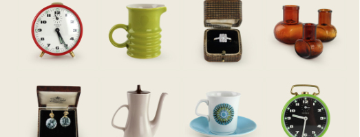
That's what happened to me here. I have no clue what More Rare does. I'm guessing it's a shop, but they may do product photography, or industrial design, or maybe none of those at all. The thing is, it doesn't really matter. The photos are crisp, bright, and well done and are placed in a very symmetrical and orderly manner. The name "More Rare" is crisp, clean, and easy to read. No matter what they do in actuality, they found a design that is pleasing overall (and kind of universal.) While it wouldn't work in every sense, to me, that's a pretty awesome thing to accomplish.

Tags: design, more rare
← announcement! courtneykhail on etsycraving: tattly friendship bracelets →
Back to Top

© copyright Courtney Khail, LLC 2007-2023