Good Design

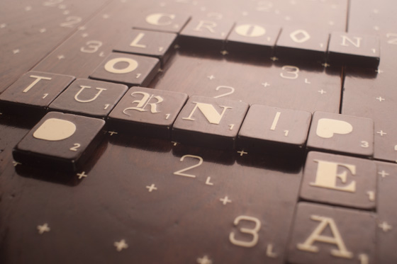
Good Design: Andrew Capener Designer Scrabble

Scrabble concept created by Andrew Capener via Design Crush

It's really not that difficult to beat me in Scrabble (most likely because the moment I see the mixed up tiles I forget almost every word I've ever learned past "cat" or "dog,") but at least this way I could focus on the pretty board and it's different tiles as opposed to my losing score.

A little more on the project thanks to Monoscope:

“The idea was to excite people about typograqphy by giving them the ability to choose what font their scrabble set would come in. The set would come in the font of your choice or with an assorted font pack. The scrabble board and interior box are made out of solid walnut, and the exterior box is made from birch. Each of the 6 board pieces is magnetized to fit together perfectly and each piece slides nicely into its respective slot in the box and is secured by interior magnets as well. The interior of the exterior box as well as the bottoms of the 6 board pieces are lined with cork, to protect them while in use.”

(Too bad it was just a concept. Looks like I may just have to make my own!)

Good Design: Prunean Business Cards

Ovi Pruvean cards designed by James Pruvean via Lovely Stationery

Fabulous right? Talk about getting to the heart of what you do visually. These business cards were designed by James Prunean for his brother, Ovi, who is a painter. I love how he took something as recognizable as a paint chip and made it his own. And blind embossing? Yes, please. (The letterpress was created by Kristin Kotack.)

Good Design: Positype

via here

So the ever talented Neil Summerour just launched his new website and it is beautiful.  It's clean, bold, has everything located in one central place. Oh! and it has a ton of white space (I love white space.) Not only does it show off tons of Neil's typefaces, but it also showcases his lettering work. AND he includes sketches! I'm such a sucker for sketches. Don't just show me the final product all shiny and new- show me the hard work; the out takes; where the pen (or lipstick in one example) met paper and the thought became real. (yes, I am quite aware that I am a nerd and no, I am not ashamed.)

And I'm not just singing his praises because he's one of my closest friends, or because he put my site together (which yes, I am a little biased towards but it is pretty awesome,) or even because I can see some of the suggestions I made actually made it onto his site (even more awesome.)

Nope.

I'm saying that because it's true and because Neil isn't one to shout it from the rooftops, even if he should. He actually isn't one to speak much about himself at all. Reading his "about me" section, I learned things I never knew and I've known him for over 5 years. Granted, one of those things was blood type and that's not something that normally comes up in conversation. At least not in conversations where you aren't looking for a kidney or something. ( To be honest, I can't even remember my own blood type. I think I'm O, but I don't give blood so I don't really know. And before anyone tells me why I should give blood, I don't hit the weight requirement and I don't like seeing my blood drain out of me so no donating for me.)

But back to the point of the post- the site. Go on and click here and take a moment to look at the awesome things he creates. Maybe you'll even recognize a few things he's done- like work for Victoria's Secret or Panera Bread. Heck, even ABC is on his client list. (He's kind of a big deal.)

And now, if you'll excuse me I have to go admire fonts like Epic and Magneta (and screen any "I can't believe you wrote a post about me" phone calls I may be receiving...)

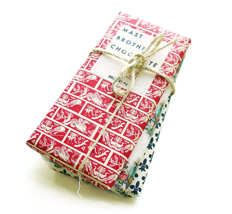
Good Design: Mast Brothers Chocolate

mast brothers chocolate via oh joy

I'm not 100% sure why I like this packaging so much because it goes against so many branding "rules" I've learned- but I do.

I love the rustic patterned paper, the twine, and the simple sans seriff type. I love how approachable and "cozy" each one is; how unlike most chocolate bars that look identical (and feel mass produced) these have a one of a kind, "made especially for you," artisan feel.

And all this was felt before even tasting the chocolate.

Guess I just answered why I like it so much.

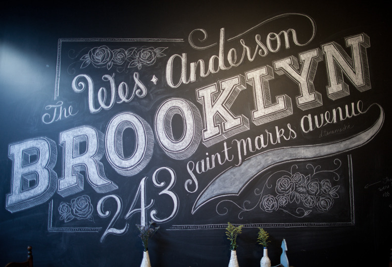
Good Design: Dana Tanamachi and Chalk Lettering

Dana Tanamachi found via 100 layer cake

I'm not usually a fan of chalk (I cringe ever time someone writes with it- something about the scratching sound) but this may change my mind. How amazing is her work? Each one of these is hand drawn in chalk. Kind of sad that it's only able to be enjoyed for a short time because the lettering and composition is really beautiful.

(Also, just wanted to send a little shout out to my friend A. who is celebrating her 25th today! Happy Birthday!)

Good Design: Sheffield Honey Company

via DED Associates

So confession. I really don't like honey by itself. And since I am not a tea drinker (yea yea, gasp. I'm a Southern who doesn't like tea. Actually take that back. I like cold green tea with mango and the peach sweet tea at Sun in My Belly, but besides that I think it's gross. I once tried to drink some herbal stuff to get rid of a cold and all I got out of it was a feeling of drinking hot water flavored with weeds and a package of tea I'll never finish. And don't get me started on people trying to convince me I like tea by giving me sweetened "cold fruit teas." People, that's called juice. If I like it, it's because I like juice. Okay back to the point...) since I don't drink tea, I really don't have a reason to have a ton on hand unless I'm baking with it (hello baklava!) Even so, I am drawn to it's beautiful various amber colors and normally spend a decent amount of time on the honey aisle at the farmer's market. And you know what? There are a lot of really unattractive honey packages. But this one, designed by DED Associates, is gorgeous. It's clean and simple, uses a very too the point easily readable sans seriff font (which automatically reminded me of clean science labs, composition notebooks etc. and won points with me) and the best part in my opinion? The use of a barely off white label (with just a hint of color where the type of honey is showcased) makes the honey pop in contrast and the black top acts as a clean modern frame to the whole package. Just beautiful.

Tea drinker or not, I'd put this on my shelf any day.

Good Design Thursdays

I began this blog as a way to show people the artist "behind the company"- to give a little more of a glimpse of who I am, what I love, what inspires me etc. As the beginning of a new year rolled around, I brainstormed ideas of how exactly to do that. That's when I came up with an idea- a resolution if you will- to implement an editorial calendar for the blog.  That way I would stay on point and give myself a deadline of sorts to hold myself accountable to (because there have been way too many days I just couldn't think of something to write about so I just skipped the whole process all together.) If you've been following the past 2 weeks you've already seen the editorial calendar in progress. Mondays are sneak peeks from the studio- projects I'm working on (both business and personal) as well as glimpses at my personal artwork, Tuesdays are home to color inspirations where I combine various photos I've collected or taken into color combinations that I find inspiring, Wednesdays are "cravings"- items I've found that I would love to incorporate into my life and Fridays are link days- a whole post dedicated to the awesome things OTHER people are creating. Now what you may (or may not) have noticed is that Thursday was left out of that calendar- and for good reason. I had NO clue what I wanted to share on Thursdays and I didn't want to waste anyone's time by just posting up some regurgitated something or other just so my traffic stayed consistent. Of course, that just led to "dead air" as Thursdays remained postless.

Until now.

Yesterday afternoon I was flipping through the book A Visual History of Typefaces and Graphic Styles (it was a Christmas present from my sister and yes, I actually enjoy flipping through books about typefaces. I have long since learned to embrace my nerdiness.) which was followed soon after with a stint on designworklife and a few other branding/packaging blogs, only to be followed by me scrolling through desiretoinspire, flipping through the newest House Beautiful and clicking through the new Lonny Mag. I'm only giving a play by play because it wasn't until later- after this slightly ritualistic inspiration hunt- did it hit me. THAT is what I would share on Thursdays.  The things around me that inspire me, that I think are beautiful or unique- the things that shape my own work (both consciously and subconsciously.) So from now on, Thursdays will be dedicated to "Good Design." Things I find to be good design because of how it resonates with me. It could be fashion, interior design, architecture, packaging, typefaces- whatever- as long as I find it inspiring. I'm hoping this will not only give more insight into what makes me tick, but it will also be a great way for me to catalog all of the images I find around the web.

So yea. Long story long, I now have a fully functioning editorial calendar for the blog. (yay!) The first post will go up later today!