good design

good design: hubert's half and half

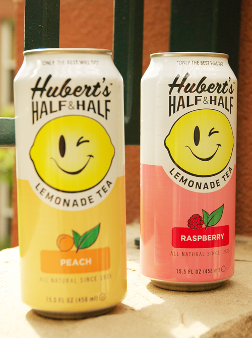
good packaging huberts half and half via courtney khailguess they didn't want to follow their "only the best will do" motto. photo via courtney khail

One wrong turn at the grocery store and I came face to face with a massive drink display- cans upon cans of a lemonade/tea blend waiting for me to take some home. I hesitated for two reasons. First, I've never had a canned tea that was good so I normally steer clear from them, and second, I don't really see the purpose in paying for something that's canned when I can make it fresh at home. But there they were. Happy, smiling faces coaxing me "to just try them" and how could I not? It was all natural! The packaging was super fun! Cheerful, bright, slightly retro type. And they were on sale. So I bought two, took some photos to share with y'all, and cracked one open to try.

What happened next I didn't quite anticipate. My mouth was flooded with the most artificial taste I've ever had (and this includes orange Fanta.) It was horrible! Thinking it might just be me, I asked J to try it. Apparently it wasn't just me.

Just goes to show you how much packaging affects what we buy. I had my doubts, but because it was so cheerful and well done, I went against my gut and took a chance. Here's to hoping I learned my lesson.

good design: Cask & Larder menu

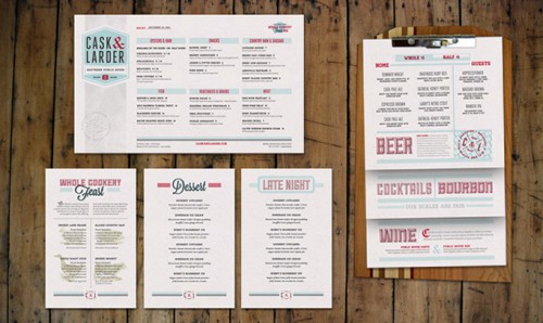
via art if the menu

I love well designed menus. I find it so disappointing when an amazing restaurant does everything right, but then the menu just falls short (think computer paper, mixed common fonts, and a horrible layout.) Very few restaurants can pull off the "we just printed this off in the back office" but so many try. This menu the same for Cask & Larder proves just how much menus can do for a restaurant. By carrying the same fonts, colors, and retro feel throughout the menu, it looks cohesive, well thought out, and professional.

Good Design: copper bikes

via van heesch design

J and I just bought cruisers a few days back (mine is a blue Electra and I am in love with it and his has flames which makes me laugh every time I look at it) and ever since then I've been checking out bikes. When this one came across my screen, I knew I needed to share it- even if it's not the most practical (sure the patina it forms would be beautiful, but pretty sure my jeans would get ruined.) The thing is though, it takes something that is pretty ordinary (a bike) and elevates it to something incredibly beautiful (a copper sculpture) and to me that's a pretty incredible thing to do.

Good Design: End of The World Survival Kit

found on blog milk via menosunocerouno

Whenever anyone brings up "the end of the world," J and I have alway joke that if anything happened that we actually needed to "survive" for a few days we'd be fine thanks to the crazy amount of camping equipment we have. Of course, nothing we have is as stylish and beautiful as this end of the world survival kit by menosunocerouno. Water, matches, mexican chocolate- all wrapped in color coordinated black and yellow packaging. (Just because it's the end of the world doesn't mean you have to go out without good design haha)

Good Design: Seinfeld

via nathan hardy's etsy

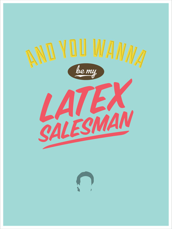
I admit that I was never really big into Seinfeld until J and I started dating, but I blame that more on never really making time to watch it, not because it's not great. Actually, I find it to be hilarious. I'm pretty sure I've now seen every episode (twice) and it's not unusual for us to bring Seinfeld quotes into our everyday life. It's obvious then that when I saw these I immediately fell in love. The bold colors, the silhouettes, the graphic type- Nathan Hardy, you did a fine job.

Good Design: Altitude Summit Business Cards

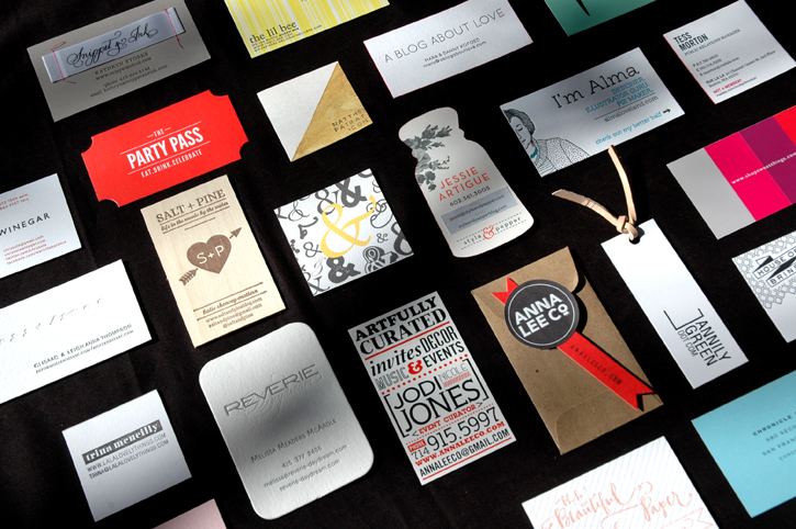
It's no surprise that when attending a conference full of design bloggers you'll come home with a TON of amazing business cards. (I'm actually still finding cards stashed in my purse, in my carry on- I even found a lone card in my coat.) The creativity of these ladies (and gents) completely blew me away.  Cards packaged in leather or glassine envelopes, accompanied by sprinkle filled salt shakers, bracelets and mini hand drawn illustrations- they were exceptional. And while I have to admit I normally prefer very crisp, clean designs, these creative minds introduced me to a whole new world of possibilities. Here is a sampling of some that stood out the most to me. That said, every single card I received was beautiful and I wish I could have included them all. Hope you enjoy!

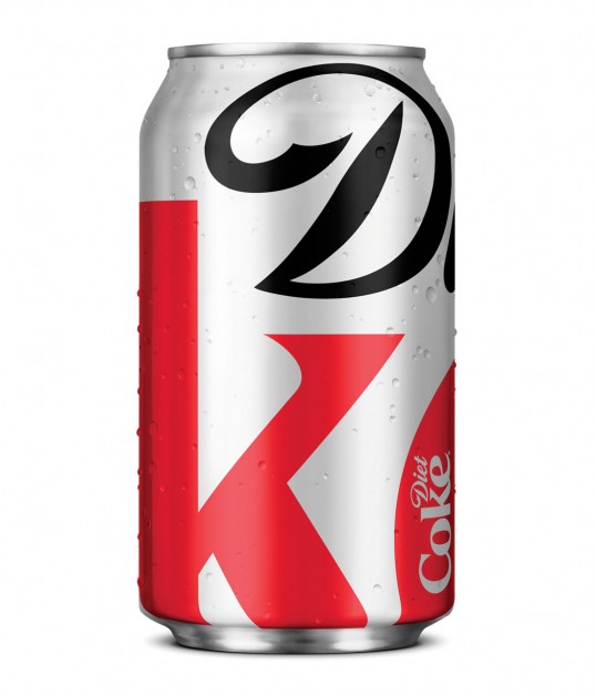
Good Design: Diet Coke

Turner Duckworth redesign of Diet Coke via lovely package

I am an avid Diet Coke drinker (I don't drink coffee so it's where I get my caffeine,) and a couple of days I opened my frig to find that the Diet Coke can looked different-and not just different, but awesome. I love the enlarged logo that relies more on the style of the letters and the colors, instead of the words. I really hope they keep this one around!

A little more info about the redesign:

“The latest evolution in Diet Coke’s iconic “Stay Extraordinary” campaign features a modern new look for fall on the Diet Coke aluminum can and a series of new ads on television and out-of-home. The ads connect with consumers using the witty and smart tone that marks the unique voice of Diet Coke." (I never thought of Diet Coke having a voice, but I'll go along with it.)

"“The new Diet Coke design is at once understated and overstated,” said David Turner, partner Turner Duckworth. “The understatement of a monogram, rather than the full name, and the overstatement of the extremely enlarged logo, both demonstrate the brand’s renewed self-confidence.”

Apparently Diet Coke also rewarded some of their "most loyal customers" with a specially designed refrigerator filled with Diet Coke. I'm going to assume mine was lost in the mail.
Good Design: Fiat 500 flip book

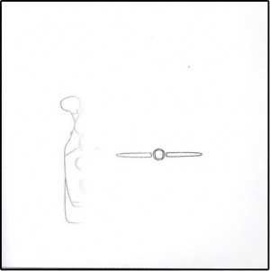
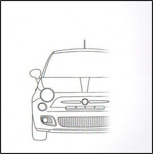
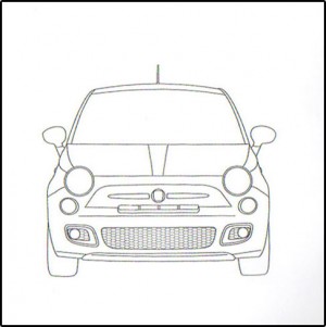
I think I mentioned that a few weeks ago J and I went to the Auto Show here in Atlanta (if not, that's me mentioning it.) While you're there, every manufacturer is trying like crazy to reel you in and convince you to buy a new fill in the blank, and while doing so they load you up with brochures, pamphlets, etc. Mostly they were all the same- glossy pages filled with specs and photographs showing the same 5 angles everyone does (action, front, back, side, and interior) of their different cars. The one that stood out the most though was Fiat. Yep, the Italian company that is bringing the Fiat 500 to America. (If anyone is curious, it's actually a pretty awesome little car and is incredibly roomy and safe feeling- unlike the Smartcar which I feel is simply a deathtrap. Personal opinion of course.) Anyhow, back to the promo pieces. By the time we reached Fiat my purse was filled with brochures and becoming incredibly heavy so when J brought over another one- and this one a book no less- I said no. I didn't want to carry anything else.  He insisted and told me just at least look at it before refusing. Good thing he did, because instead of simply giving you a boring promotional booklet, Fiat gave you a flip book. A flip book! And I for one love flip books. Turn the pages and ta da! A Fiat 500 appears. Simple, clean, and engaging- exactly what a promo piece should be.

Here's a taste of what it offered:

Those clever Italians.