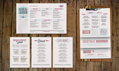
via art if the menu
I love well designed menus. I find it so disappointing when an amazing restaurant does everything right, but then the menu just falls short (think computer paper, mixed common fonts, and a horrible layout.) Very few restaurants can pull off the "we just printed this off in the back office" but so many try. This menu the same for Cask & Larder proves just how much menus can do for a restaurant. By carrying the same fonts, colors, and retro feel throughout the menu, it looks cohesive, well thought out, and professional.

