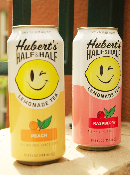
 guess they didn't want to follow their "only the best will do" motto. photo via courtney khail
One wrong turn at the grocery store and I came face to face with a massive drink display- cans upon cans of a lemonade/tea blend waiting for me to take some home. I hesitated for two reasons. First, I've never had a canned tea that was good so I normally steer clear from them, and second, I don't really see the purpose in paying for something that's canned when I can make it fresh at home. But there they were. Happy, smiling faces coaxing me "to just try them" and how could I not? It was all natural! The packaging was super fun! Cheerful, bright, slightly retro type. And they were on sale. So I bought two, took some photos to share with y'all, and cracked one open to try.
What happened next I didn't quite anticipate. My mouth was flooded with the most artificial taste I've ever had (and this includes orange Fanta.) It was horrible! Thinking it might just be me, I asked J to try it. Apparently it wasn't just me.
Just goes to show you how much packaging affects what we buy. I had my doubts, but because it was so cheerful and well done, I went against my gut and took a chance. Here's to hoping I learned my lesson.
