Good Design

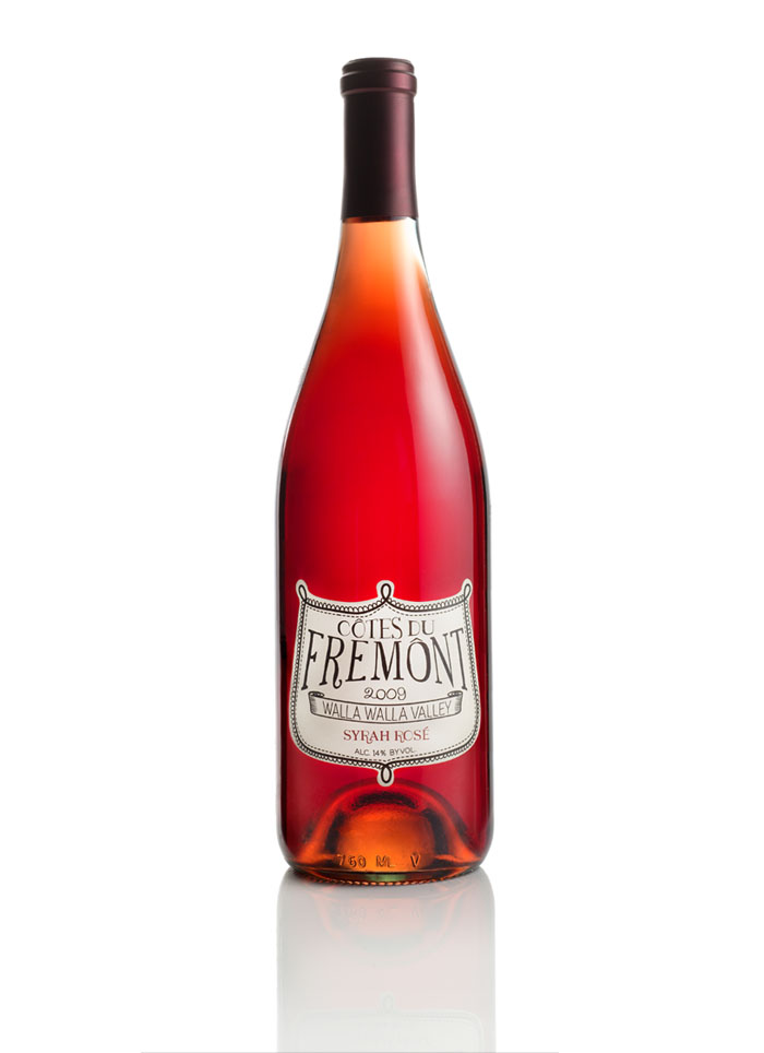
Good Design: Tap Water

designed by Racquel Youtzy via lovely package

I love this packaging for tap water. Unless we are camping (like right now) we rarely buy bottled water. And even though we like knowing it keeps plastic out of the landfills, the main reason we don’t buy bottled is that our filtered tap water* tastes just as good (if not better) than many of the brands on the market. Of course now with these bottles, we all can enjoy better tasting (inexpensive) water and still feel all special with our beautifully designed glass bottles. I can’t help but think about how hilarious it would be to put these out for a meeting or a dinner.You know, for everyone who insists on bottled water.

*speaking of bottled water- did you know most bottled water is actually just filtered tap water with or without added minerals? If it says it's from a "municipal water source" that's what it means.

Good Design: Watercolor lettering

via Karen Kurycki

First, this is called "Is it worth it, let me work it..." so it's already awesome. Second, I'm a huge watercolor fan (as if that wasn't obvious) so I love seeing this type of lettering.

Speaking of watercolor lettering... an awkward story from my life:

I went to a (pretty well known) photographer's show and upon seeing his book (that featured water colored lettering) I asked who created it/ how it was done. The answer? Something to the extent of "Someone I know... and I think she painted it."

Umm. Thanks? He seemed uncomfortable by the question, which made me uncomfortable, and I didn't know how to respond so to make it even more awkward (I'm kind of gifted at that) I think I simply said "okay? cool." then stood there for a minute in silence and just walked off. At least he tried.*

*For the record, I didn't ask about how he styles his photos because some one before me asked that and was told he doesn't. He just goes to stylish people's places and uses whatever they have arranged.

Good Design: Optimo Fine Hats

Optimo Hat Company design work by Knoed

My dad is known for his Stetson style hats-his outfit just isn't complete without one. While many actually are Stetson's, he is always game for a new hat as long as it "feels right" and is of great quality. When I saw Optimo's hats I immediately thought of him.

Now let's get to the good design part. Optimo's branding is both polished and professional with a touch of historic charm. I love their font and color choices, (both in print and on their site) as well as the use of tons of white space, but I especially love the instructions printed on paper shaped to the inside of the hat. What a wonderful touch!

Speaking of a wonderful touch, they never use glue on their hats. Impressive, right? Everything is held in place by artful folding and thread. Talk about craftsmanship.

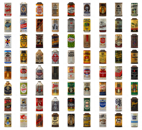
Good Design: Beer

found on swiss miss via flickr

I always wished I liked beer. Not because it seems refreshing, or because it's cheap (even though that would be helpful,) but because the labels can be such amazing little pieces of art. Alas, I'm a bourbon girl.

Even so, that doesn't stop me from admiring the work- especially the kind found on vintage cans like these.

*fun fact, my husband had a beer wall before I moved in showcasing the different bottles and labels. Of course, it didn't stay around very long after I moved in, but I couldn't help but appreciate the effort and design.