Good Design

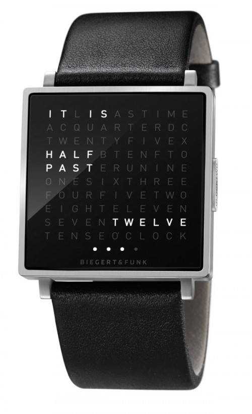
Good Design: QLOCKTWO

via here

Now you won't have to admit that you can't read a traditional (non digital) watch. (Anyone else baffled by how many people can't do that without seriously concentrating?)

I wonder if it could say "stop looking at your watch, you already know you're running late." That could be very helpful...

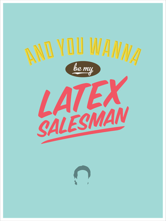
Good Design: Seinfeld

via nathan hardy's etsy

I admit that I was never really big into Seinfeld until J and I started dating, but I blame that more on never really making time to watch it, not because it's not great. Actually, I find it to be hilarious. I'm pretty sure I've now seen every episode (twice) and it's not unusual for us to bring Seinfeld quotes into our everyday life. It's obvious then that when I saw these I immediately fell in love. The bold colors, the silhouettes, the graphic type- Nathan Hardy, you did a fine job.

Good Design: Bricos tools

via lovely little package

I love how bold this packaging is; it's part old air mail envelope and part really patriotic. Of course, that's probably just because it's red, white, and blue stripes. I bet if you asked someone outside of America or France, they wouldn't find this patriotic at all. Isn't it amazing how much your surroundings can influence your perception?

Good Design: Amy Rodchester for Newcastle Dance Festival

via here

I love the retro vibe of these posters (designed by Amy Rodchester for the Newcastle Dance Festival.) The muted colors, the black and white photos- even the styling is a nod to a more nostalgic time in advertising.

From the artist:

Each poster targets a different generation, inspiring children to dance, encouraging youths to be creative, motivating adults to continue exercise and reminding the elderly of their time in the old dance halls.

A great concept isn't it?

Good Design: West Egg

via bonnie tsang

If you live in Atlanta and haven't gone to West Egg yet, get on it. (If you visit here, do your best to make a stop.) We ate dinner here just last Saturday and I remember looking at their menus and talking about how much I loved the design of it. Bold, graphic, various type sizes, all wrapped up in a Manila folder- it's simple done very very well. Just like their food. This is a place where you can order biscuits and bacon while your partner eats a hearty chicken pot pie, and then wash it all down with a bourbon chocolate milkshake. Awesome, right?

Oh, and want to capture the moment? They have a filmstrip photobooth too.

So earlier this morning (when I was gawking over the beautiful images she takes) I came across photographs of West Egg taken by Bonnie Tsang and took it as a sign that today was the day to share this little gem with y'all. You can see more images here.

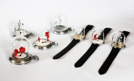
Good Design: Watch Sculptures

Dominic Wilson watch sculptures (The detail is called adventures of a  young vegetarian. It's of a girl saving a pig from a butcher.)

normally my "Good Designs" focus around typography and graphic design, but sometimes I find something that blurs the line and I have to share it.

J. is a huge watch lover- whenever he asks me to "come look at this" 9 times out of 10 it's a watch he'd like to have.  And whenever we go shopping and I can't find him, I know just to beeline it to the watch section where I will find him- mesmerized by the intricate beauty of rows and rows of watches. To be honest, he acts similarly with cars, airplanes, and most everything the History Channel plays about the World Wars. It's pretty endearing.

Main point, I've now seen a lot of watches. (And WW2 documentaries.) But I never expected to see one like this. The attention to detail in the sculptures, the roundness of the glass dome, the movement (yes, I know I'm geeking out here) it's all just so well designed and designed so beautifully. Not to mention the social messages he portrays. Example: There is a man "so engrossed in his iPhone that he doesn't even notice a monkey balancing on the head of a weightlifting boy on the arm of an elderly roller skater."

This is what the artist, Dominic Wilson, said about them:

I have a new big project to show. I’ve put tiny figures onto watch hands in order to create mini animated scenes. I had the idea last year during my Speed creating project, but decided it was too good to rush. 8 month later I showed a prototype to Dezeen and they commissioned me to make a collection. The watches use customised model figures and I also made objects, like a miniature looted LCD tv. The glass domes were specially made to fit by Wearside Glass Sculptures in my home town of Sunderland at the National Glass Centre.

This is one of those pieces I'd love to own and have out for everyone to enjoy. Wouldn't you love to sit down in someone's living room to see the street sweeper watch lying on the table? I would. And then I would proceed to geek out in front of them about it the entire time I was there, because, well you know. That's how I roll.

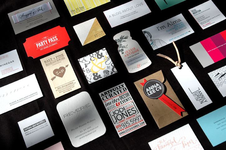
Good Design: Altitude Summit Business Cards

It's no surprise that when attending a conference full of design bloggers you'll come home with a TON of amazing business cards. (I'm actually still finding cards stashed in my purse, in my carry on- I even found a lone card in my coat.) The creativity of these ladies (and gents) completely blew me away.  Cards packaged in leather or glassine envelopes, accompanied by sprinkle filled salt shakers, bracelets and mini hand drawn illustrations- they were exceptional. And while I have to admit I normally prefer very crisp, clean designs, these creative minds introduced me to a whole new world of possibilities. Here is a sampling of some that stood out the most to me. That said, every single card I received was beautiful and I wish I could have included them all. Hope you enjoy!