Good Design

artist spotlight: amy friend

I found Amy Friend's work through one of my good friend's blogs. Kristin was showing Amy's amazing light series (which was originally what I planned to post about,) but while looking over Amy's portfolio I found something that pulled at my heartstrings even more.

amy friend via courtney khail

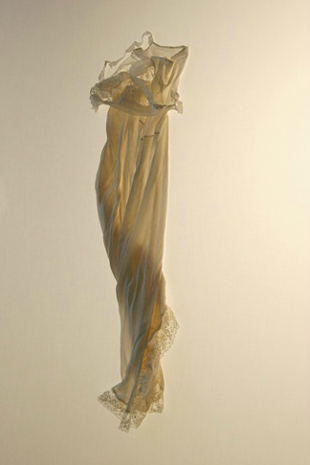
Amy's "Soon This Space Will Be Too Small" series (where the following photos are from) focuses on a collection of clothing from her deceased grandmother. Drawn especially to her nightgowns, Amy photographed each one with such care and such beautiful lighting that the pieces seem to come alive. Pieces of cloth that once stayed tucked in a drawer, now seemed full of motion, illustrating a life that once was. Aren't these pieces beautiful?

amy friend via courtney khail

It struck such a cord with me because a similar "collecting" of items happened when my grandmother passed. Here was my entire family, wandering through a house that felt empty without her presence, collecting items that we didn't want to part with-items that reminded us of her. A carved wooden bear, a turquoise insulator (the glass electrical ones which she collected,) sepia toned photographs from her childhood- little pieces of her life that we held on to in order to keep her memory alive. Being most similar to her size, my mom ushered me into my grandmother's closet to look through anything I might like. Sitting there surrounded by her amazing collection of belts and scarves, I couldn't help but cry. It felt intrusive, almost like a violation. These weren't mine. I felt I had no right to them. (Nor did I really want to accept that she was gone.) But with my mom sitting there, holding up piece by piece looking for my response, I tried to be strong and just push through. Laid across my grandmother's bed was an array of colors, styles and materials that illustrated a timeline of her life- meticulously hand beaded belts from the 80's, an amazing hammered bronze wrap with gold cording from I'm guessing the 70's, a black belt with a beautiful center knot from who knows when- pieces she loved and held on to despite probably not having worn them for years.

And although it was hard to do, looking back I'm happy my mom made me because now every time I slip into one of my grandmother's gowns or hook one of her amazing belts around a dress- I can't help but smile and feel like one of my closest friends is always near.

Good Design: copper bikes

via van heesch design

J and I just bought cruisers a few days back (mine is a blue Electra and I am in love with it and his has flames which makes me laugh every time I look at it) and ever since then I've been checking out bikes. When this one came across my screen, I knew I needed to share it- even if it's not the most practical (sure the patina it forms would be beautiful, but pretty sure my jeans would get ruined.) The thing is though, it takes something that is pretty ordinary (a bike) and elevates it to something incredibly beautiful (a copper sculpture) and to me that's a pretty incredible thing to do.

Good Design: End of The World Survival Kit

found on blog milk via menosunocerouno

Whenever anyone brings up "the end of the world," J and I have alway joke that if anything happened that we actually needed to "survive" for a few days we'd be fine thanks to the crazy amount of camping equipment we have. Of course, nothing we have is as stylish and beautiful as this end of the world survival kit by menosunocerouno. Water, matches, mexican chocolate- all wrapped in color coordinated black and yellow packaging. (Just because it's the end of the world doesn't mean you have to go out without good design haha)

Good Design: Scholz and Friends

via here and here

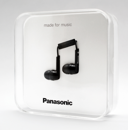
I stumbled across Scholz & Friends while looking over Lovely Package's recap of the 2012 D&AD Awards Packaging Design Winners, and after playing around their site (which I never translated from German so I kind of just clicked things) I fell hard for their ear bud and ear plug packaging. Playing off of a simple music note and a volume control button, Scholz and Friends created two beautiful package designs that utilize a common every day item/symbol and transcend it to something entirely unique and special.

Good Design: Barcelona city planning

Eixample via here

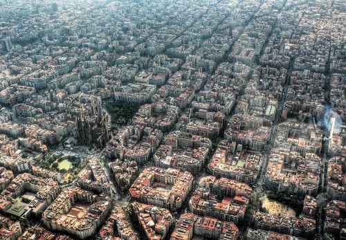
A little different from my other good designs, but when I came across this aerial shot of Barcelona's district, Eixample, I couldn't help but be amazed by the clean lines and perfectly arranged streets and really wanted to share it with you all.

From the site:

"Constructed in the early 20th century, Eixample is a district of the Spanish city of Barcelona known for the urban planning that divided the district into octagonal blocks. Influenced by a range of schools of architecture, Eixample was designed in a grid pattern with long streets, wide avenues, and rounded street corners. Despite being in the center of a thriving European metropolis, the district provides improved living conditions for inhabitants including extensive sun light, improved ventilation, and more open green space for public use."

Isn't that awesome? EACH little octagon has a central hub and is set up just to make life better for those who live there. I love that idea.

Good Design: Milk Carton

via visual advice

Although I doubt it holds nearly the correct amount of milk, I would really appreciate opening someone's frig and finding this. I say opening someone else's frig because I'm lactose intolerant and therefore this wouldn't really have a place in our home, regardless of how cool it is.

Maybe I could empty it out and fill it with something else...

But then I'd probably have someone pouring orange juice in their coffee and feel bad.