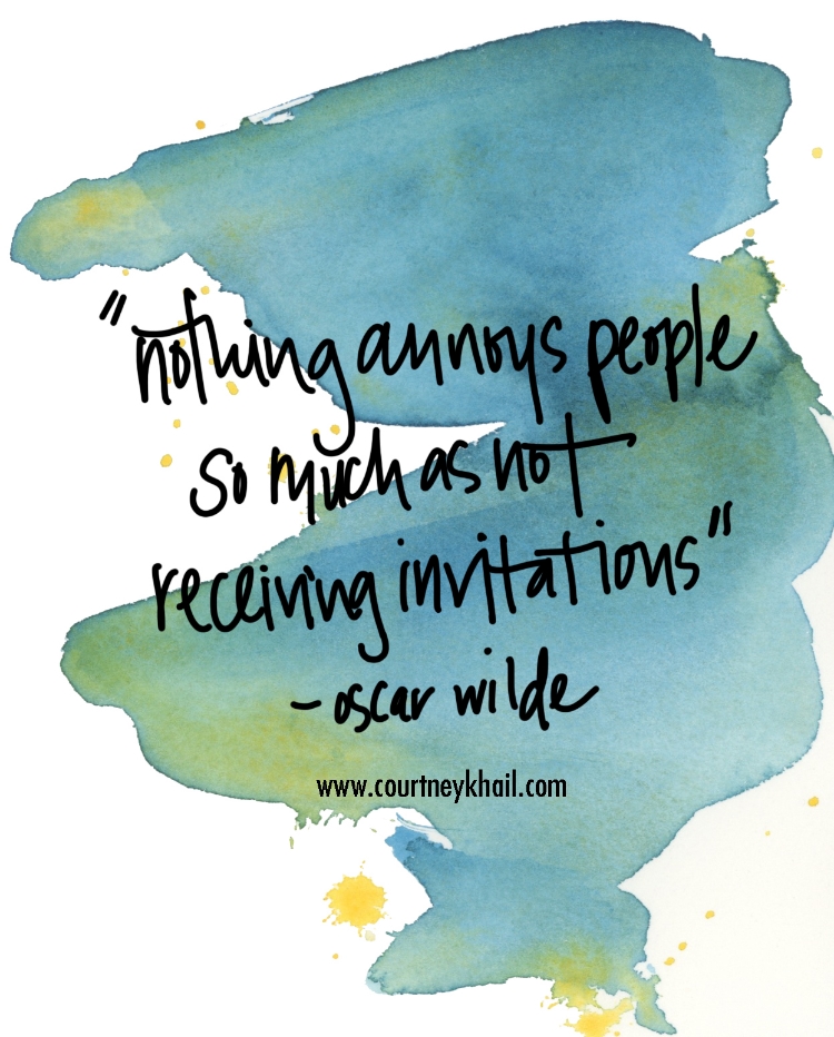
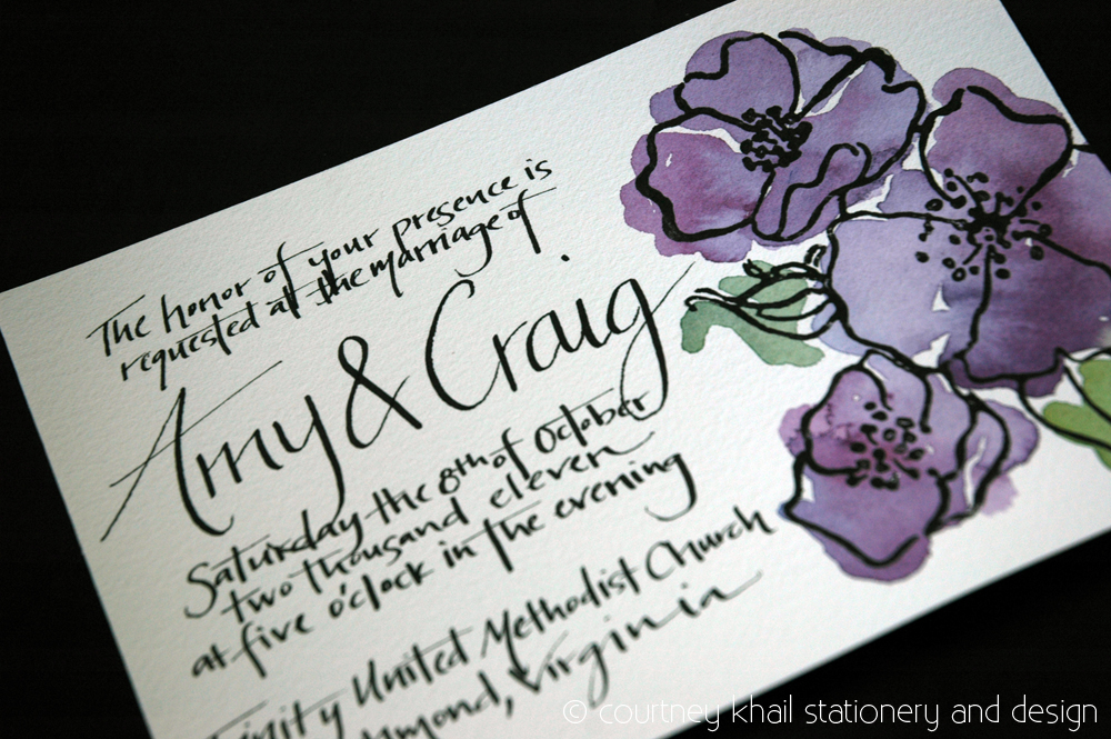
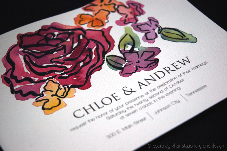
Seeing how engagement season is in full swing, I thought this quote was only fitting. Invitations are your guests' very first glimpse into your wedding and although you most likely will not be able to invite every person dear to your heart, make sure those that you do invite feel special and excited when they receive your invitation. Plus, with all the time and energy you've put into planning an amazing wedding to celebrate the love you and your partner have, it only makes sense that the invitations to that event are just as amazing! If you're stuck on how to make that possible, I'd love to chat about all the possibilities and create a custom wedding invitation just for you!
invitations
jessica + will wedding invitations
Pink Spring Wedding Invitations: jessica + will
Now that my sister and brother in law have been married almost three months, I figured it was about time to share their invitations with you all! My sisters favorite color is pink (she's the super girly daughter) so it was no surprise that when asked "what her colors were" she replied "blush and bashful." (If you have not watched Steel Magnolias that reference was probably lost on you. Then again, if you haven't seen Steel Magnolias you are seriously missing out. And not the new one- the original one with Julia Roberts. Go ahead and pull it up on Netflix. You can thank me later.)
Anyhow, back to my sister. I was honored when she asked me to do her invitations, but also knew it was a tall order simply because it was my sister. That's a lot of pressure because I wanted them to be just right. (And because I am a perfectionist that likes everything to match, I knew it also meant I'd be doing her menus, signage, escort cards, programs, etc.)
I knew she wanted a mix of styles- two parts English Garden tea party, one part the Great Gatsby, and a dash of Southern vintage- which creates a unique set of challenges. In the end, I combined my signature handwritten names with a sans serif font to mesh the modern with the vintage/intimate feelings of their hand inked names. Then I created a painting that combined the wildflower feeling she wanted with the bouquets of the 20's (with their long cascading leaves and petals) all while using the color palette of antique floral china patterns that would be found during an English tea party. (Well, I mostly stuck to that- I amped up the pinks since that's her favorite color.)
I love how it all turned out, but most importantly, she loved it which was really all I was concerned about!
And because I mentioned them above- here are a few photos of the other elements I did as well. (The programs mimicked the invitations, the escort cards were tied to small keys since the first time her husband said "I love you" he gave her a key necklace symbolizing that she had the key to his heart, the menus were kept simple but still combined the handwritten aspects from the invitation, and lastly- each table had a love quote that I inked and my sister attached to a gold backing.)
Everything came together so well and looked beautiful, but in the end (as always) all that mattered was the love between my sister and her new husband. No amount of beautiful details could outshine that!
Studio Sneak Peek: amy and craig
handwritten rose invitation via courtney khail stationery and design
Just wanted to stop in to give you all a glimpse of a wedding invitation I painted a little while back for a couple having a intimate under 30 person wedding. (P.S. I love the idea of an intimate dinner party wedding.) I was so honored to be able to create these for them! Next week I'll show the gifts I made for their guests...
Craving: Madeline Envelopes
via LeaSeguin
Aren't these envelopes so cute? (They are made from a copy of Madeline's Christmas!) I'd love to create invitations for a kids birthday and use envelopes like these.
Studio Sneak Peek: Lilac and Rose
"Lilac & Rose" copyright courtney khail stationery and design (feel free to share, but please give me credit and link back to my site.)
Week three of my new design introductions is the design "Lilac & Rose." I love how unique the lilac is- the color gradients, the shapes, the "petite-ness" of them. While they all follow the same basic design (petal numbers, growth patterns, etc) there are such beautiful nuances in them. I wanted to balance those nuances with the familiarity of a common everyday rose. By playing with scale and deconstructing the plant, I was able to bring focus on the individual lilac blooms as opposed to the entire plant. Once I did that, I arranged them in an almost dance-like pattern around the rose in order to keep your eye bouncing around the composition instead of getting stuck in any particular section. And given that I'd already taken a lot of artistic leeway with the lilacs size and shape, I decided to go ahead and play with color as well- morphing the normal purple into a warmer magenta, then a purple-ish orange and finally into a yellow.
Since the design itself has a lot going on, I opted for a simpler, clean layout that focused on the names of the couple and utilized a lot of white space so your eyes wouldn't get overwhelmed.
courtney khail stationery on rustic wedding chic
Courtney Khail's wedding invitations featured on Rustic Wedding Chic
Studio Sneak Peek: C Magazine feature!
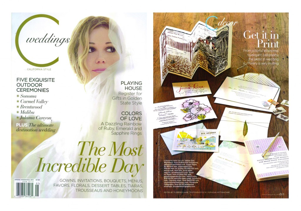 (please excuse the slightly off colors- the green is actually more of a deep gold. My scanner is being finicky.)
I opened up my mailbox today to find a very special treat- my invitations are in this month's C Magazine! (page 63 in case anyone is wondering...)
I am so overjoyed and humbled to be included in what they deem "the latest in wedding stationery." Thank you so much, C Magazine!
*Oh! And if you haven't seen the magazine yet (any of the issues, not just this one) I would highly recommend it. It is a beautiful magazine- both in layout and design as well as content.
Now if you would please excuse me, I have some jumping up and down to do.
Studio Sneak Peek: holiday party
 copyright courtney khail stationery and design
Let's go ahead and not point out the fact that it's January 17th.. almost exactly one month AFTER this party took place and instead focus on the fact that it's red and white and therefore completely fits with the whole Valentine's Day theme. (Sounds a whole lot better than "Sorry I just got around to uploading this one, guys. I was snowed in all last week and instead of remembering I made mini snowmen like this one
 (like the pipe cleaner? yea. me too.)
and watched a lot of bad tv. Speaking of which, is there really a show where brides compete for PLASTIC SURGERY?! What have we come to?! And if that wasn't bad enough, then the 4 brides compete for the "best wedding" show came on. It was about that time when I turned to magazines, only to be hit with "What was Prince Charles thinking when he gave his mother's ring to Kate?! Doesn't he know it's a symbol of a marriage filled with infidelity blah blah blah?" No people, I don't think that's what he was going for. Instead, I think he was thinking, "I want to marry this woman and I happen to also have this kick a** ring that not only is beautiful, but also is one of the only possessions I have left of my mom's. Because of all of that, I think the woman I love should wear it."* HONESTLY. The ring doesn't have to be a diamond to promise love and devotion and it's a little tacky to state in a magazine that it should be one.)
Anyhow, now that I've gotten that off of my chest back to the invitation.
Every year my sister throws a holiday party and this year I decided to help her out with invitations. We were under a tight time line (as in they needed to be designed, printed, assembled and mailed within 2 days) so hand painting was out and instead I tried to keep it as simple as possible.
Not sure my sister would agree that tying candy canes to each one was simple, but overall I think they came out great (despite a little discrepancy of colors between the string and the printing. Apparently no one else besides us noticed, but as I've said before, I'm a little neurotic when it comes to my work and therefore it kind of bugs me. But only a little or else I wouldn't share them.)
Hope you enjoy them!
Studio Sneak Peek: vernon and antoinette
It snowed something like 4-5" last night here in Atlanta (and I am not embarrassed to admit we went outside at 10p with the dog just to have a snowball fight) so every school-including J's- and pretty much everything else is closed. So in celebration of what will probably be our last "snow day" when it comes to school, we've decided to spend a nice relaxing day here at Casa Khail. Hot chocolate, a fire, lots of Netflix picks- it's going to be a good day! Before I sign off to do that though, I thought I would share a custom invitation I was working on for quite awhile. Vernon and Antoinette just celebrated their wedding this past Saturday (congratulations!!) so I figured today would be the best day to share. Hope you like them!
courtney khail on Oh So Beautiful Paper
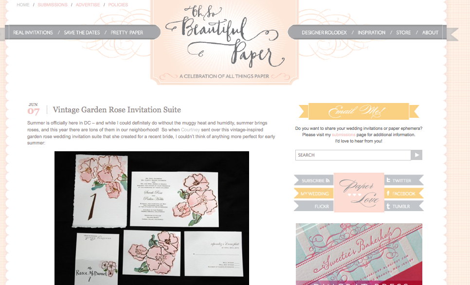 My work is on Oh So Beautiful Paper today!!! Ahh! I love. love. love. Nole's site and can't believe she shared my work. so exciting. Thanks so much, Nole!
Also, Laura Beth over at The Share Bee sent me a sweet email letting me know that she wrote about me as well. Thank you! I really really appreciate you sharing my work! It means so much to me.
You know who else I appreciate?
You all. Thank you so much for all of your support of my work and for spreading my name around. I couldn't do it without you! And if you haven't already, I'd love for you to follow me on twitter and/or become a fan on facebook!
*squeal* Talk about a great way to start off the week!!!
picnic invite
J. and I are hosting a couples picnic in the park and given that I love invitations (never would have guessed, right?) I knew facebooking this just wouldn't do. Also, since the guest list is small I knew I could really go over the top with materials etc. without killing myself with the price or the workload. This is the final product (read on to see how I made them!)

copyright courtney khail stationery and design
First, I hit up Lowes. Thanks to a really nice man in flooring, I picked up a (rather large) sample of AstroTurf for free. Luckily though, AstroTurf really isn't that expensive so even if I had to buy it, it wouldn't break the bank.
Second, I headed to the fabric store and found a plaid that would fit perfectly with the decorations for the picnic and bought 1 yard of it.
At home, I cut the AstroTurf into invitation sized rectangles (really really messy btw) and then cut the fabric into smaller (but still proportional) rectangles. After that I cut small pieces of scrap watercolor paper I had and hand wrote the main information for the picnic on them. I then hand sewed the fabric to the AstroTurf and then hot glued the info onto the middle of the fabric. (I have yet to master the hot glue gun. I always burn myself!)
If you have ever looked at the back of AstroTurf you'll see that it is REALLY ugly. (Add not so straight hand sewn threads and it's just that much worse.) To hide all of that, I covered the back with regular kraft paper. (I had a huge roll of it thanks to my mom since she knows I like to wrap all of our gifts in it.) In addition to making it look cleaner, the paper also gave me the space to write a little more about the party on the back (like direction info, what to bring, etc.) without cluttering up the front.
Lastly, I slide them into envelopes I had hand addressed in black ink, sealed them up and mailed them out!
What do you all think? Do you like them as much as I do?

