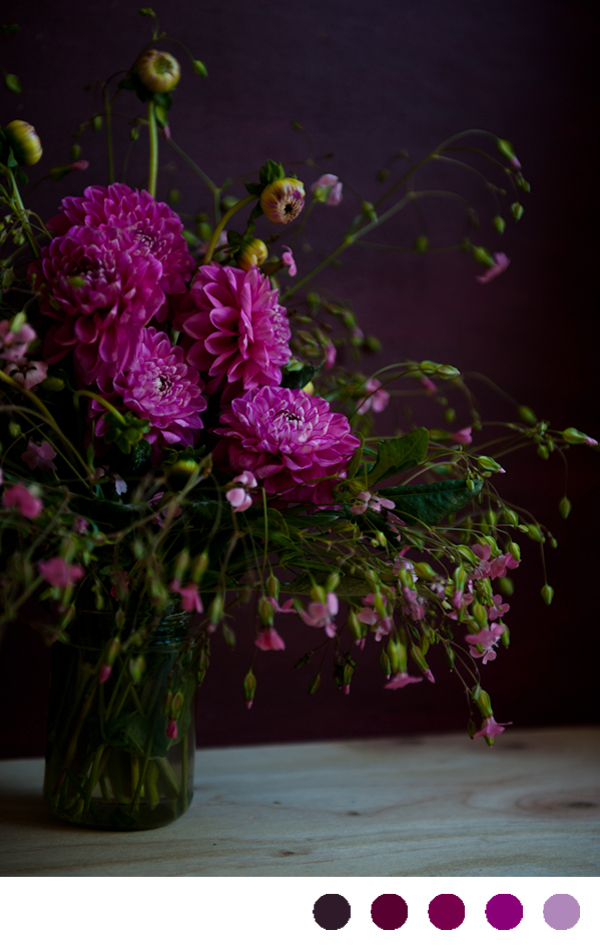
 photograph via desserts for breakfast
Kind of seems like a weird color combination, but somehow it just works. The bright fuchsia bounces off of the deep plum in a way that is both moody and cheerful all at once.
Purple
 photograph via desserts for breakfast
Kind of seems like a weird color combination, but somehow it just works. The bright fuchsia bounces off of the deep plum in a way that is both moody and cheerful all at once.
ranunculus via here
such deep, beautiful colors. (Fun Fact: Did you know Julianne Moore only buys things for her home that are green, purple, white, black, or gray? Guessing she'd like this combination!)
photo found on lyla and blu
I love how soothing this color combination looks. Wouldn't this be beautiful in a bedroom?
via a subtle revelry
Something about summer time makes me want to turn everything rainbow colored. Rainbow sprinkles? Two spoonfuls please. Brightly colored popsicles? Only if they are unnaturally bright. A new striped beach blanket? Let's not focus on the fact I live in Denver. Bright new nail polish? Just painted my toes cherry red.
See what I mean? I just can't help it.
I've had this garlic photograph for years and can't track down it's photographer. Can you help?, doodles via me, bedroom via the paris apartment, Moroccan wedding blanket via here
In my own mind, I'm not really a fan of purple. There is something too synthetic about it to me (maybe all the grape flavored lollipops or medicine growing up?) but my tune completely changes when that purple becomes a rich merlot or an earthy lavender. When that happens, I swoon over it. And paired with the papery skins of garlic- ranging from a deep beet red to the lightest of parchments, it becomes comforting and tranquil.
copyright courtney khail stationery and design
I can't show the show the whole certificate (I promised my clients,) but I did want to show a close up of the hydrangea design I painted for them. They wanted to stick with greens and purples, so I had fun alternating between the two, combining colors, and letting the paint just kind of flow. I love when my clients give me a lot of freedom because amazing things can happen. Plus, I'm so type A that I refuse to let anything less than absolutely perfect leave the studio so it's kind of a win-win for all involved. Isn't this pretty, though? I really enjoy how vibrant and modern it became.
And I know you can't see them, but they wrote their own vows and the emotion behind them brought me to tears. There is something so amazing and humbling about being able to share in such a personal moment. There I was, inking in the words they were going to exchange before entering into marriage. The words that promised they would stand by each other, support each other, and love each other always. I couldn't help but feel so lucky to be able to be apart of that and so overjoyed that these two people found each other.
I'm also the person who has to hold back tears at weddings. I can't help it. The moment the couple looks at each other and starts vowing to be a team my eyes just fill up.
handwritten rose invitation via courtney khail stationery and design
Just wanted to stop in to give you all a glimpse of a wedding invitation I painted a little while back for a couple having a intimate under 30 person wedding. (P.S. I love the idea of an intimate dinner party wedding.) I was so honored to be able to create these for them! Next week I'll show the gifts I made for their guests...
via arboreal paper
I found this board yesterday and fell in love with the various purples and whites. I might be a little biased since one of my pieces is in it, but I think that is out weighed by the fact that I'm not normally a purple fan. It's amazing to see how other people view my work, though! When I painted that piece it was part of a multicolored collection, and seemed very vibrant and colorful. Here though, it seems very calm and subtle. Think I'm digging it's multiple "personalities!"
This board was inspired by a photo I saw over on Santa Barbara Wedding Chic. I saw it this morning and just couldn't stop thinking of it. I loved the playfulness of the ice cream cones, and esp. loved the color! Sticking with a color palette of various berry tones, this is what evolved. I would love to attend a wedding like this. In my head there is a lot of laughter, twinkle lights, and yummy homemade treats. Hope you enjoy!
 row 1: flowers via saipua, anna williams ice cream cone photo via kelly oshiro
I think half the fun is coming up with the names of colors :)
And yes, I'm still on a purple kick.
 row 1: flower adornments via violise lunn, dress via ritzy bee
row 2: dress via anthropologie, window shop photo and bedroom photo via the paris apartment
row 3: boutonniere via $10,000 wedding, cake via the knot