Green

color inspiration: champagne, dusty rose and stormy seas

photo via f5,6

Although our home is very bright (I'm a white paint lover) I've always been drawn to the dark and stormy colors. You know, the deep plums, the wrought iron grays, the pipe smoke blacks- they always feel more soulful to me than cheerful yellows, hot pinks, etc. So when I saw this photograph, it took my breath away. It's dark without being overwhelming, has just enough glamour (thanks to the sequins and fabrics) and yet still feels playful because of the various party dresses. Maybe one day (when we have a house that we're allowed to paint all dark and mysterious) I'll try this in a bedroom or a powder room.

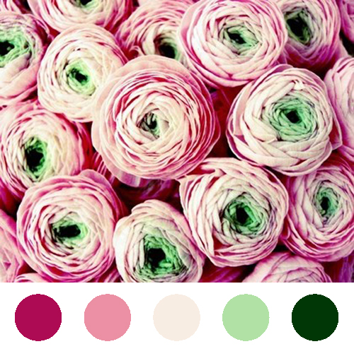
color inspiration: cranberry, spearmint, and cream

photograph via honeytree

I decided to do something different with my color inspiration today and hope you like it. Instead of trying to mesh different photos together like I've done in the past, I thought I'd give you all a glimpse at what goes on in my mind. Normally it only takes one photo to trigger a color palate in my mind and that's what I decided to share with you all today. This particular photograph I've had on my desktop for months (and months) because I was instantly drawn to the vibrant, playful colors. Pink and green together is definitely not a new concept, but here the combination looks subtle and fresh, as opposed to the loud and preppy connotation I'm used to.

So what do you think? Do you like this set up, or would you rather it go back to the way it was?

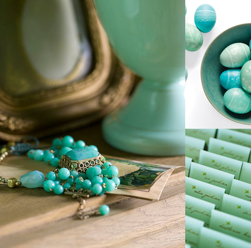
Color Inspiration: Seafoam and Turquoise

photograph via powder blue pics, eggs via martha stewart, cards via once wed

I've had this image in my inspiration folder for awhile- waiting until the perfect morning to share. Give that today's Super Tuesday and I'm about to go wait in long lines to vote, I decided today was the day for a calming, peaceful, and serene color palette. Hope you enjoy! (These colors always remind me of the early morning- just when the sun decides to peek through and brighten everything up.)

From the Studio: Wedding Certificate

copyright courtney khail stationery and design

I can't show the show the whole certificate (I promised my clients,) but I did want to show a close up of the hydrangea design I painted for them. They wanted to stick with greens and purples, so I had fun alternating between the two, combining colors, and letting the paint just kind of flow. I love when my clients give me a lot of freedom because amazing things can happen. Plus, I'm so type A that I refuse to let anything less than absolutely perfect leave the studio so it's kind of a win-win for all involved. Isn't this pretty, though? I really enjoy how vibrant and modern it became.

And I know you can't see them, but they wrote their own vows and the emotion behind them brought me to tears. There is something so amazing and humbling about being able to share in such a personal moment. There I was, inking in the words they were going to exchange before entering into marriage. The words that promised they would stand by each other, support each other, and love each other always. I couldn't help but feel so lucky to be able to be apart of that and so overjoyed that these two people found each other.

I'm also the person who has to hold back tears at weddings. I can't help it. The moment the couple looks at each other and starts vowing to be a team my eyes just fill up.

Color Inspiration: The lion the witch and the wardrobe

Northern Lights photo via here, illustration from The Lion , The Witch, and The Wardrobe movie via here Photograph by Emma Summerton and styled by Edward Enninful for W Magazine's Best in Class Shoot

I loved The Lion, The Witch, and the Wardrobe growing up. C.S. Lewis had an amazing way with words and his descriptions of the landscapes and characters put my imagination into overdrive. In particular, I always had a slight fascination with the White Witch. A few years after reading the book, I remember seeing the play being disappointed in how she was portrayed. All white with frosty eye makeup? I know she was technically called the White Witch, but I felt like the all white ensemble made her look frozen, not cold. Or worse, like a snow princess which evokes a whole different feeling. Silvers, blues, emerald greens- those are the colors I associated with her- the colors of ice. So when I came across this photo in W a few days back I couldn't help but be reminded that this is what I thought the White Witch should look like. Stark and cold, but beautiful. Shimmery and glamourous, with red lips, extremely pale skin, and slicked back black hair. I know it wasn't the intended purpose of the shoot, but thank you W for finally getting the image right in my mind.