Blue
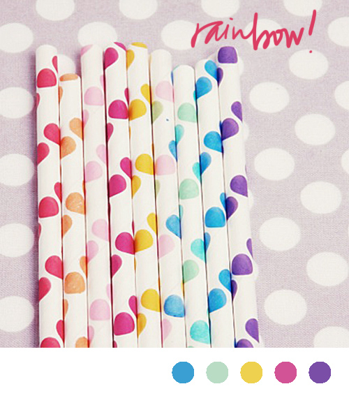
color inspiration: rainbow
via a subtle revelry
Something about summer time makes me want to turn everything rainbow colored. Rainbow sprinkles? Two spoonfuls please. Brightly colored popsicles? Only if they are unnaturally bright. A new striped beach blanket? Let's not focus on the fact I live in Denver. Bright new nail polish? Just painted my toes cherry red.
See what I mean? I just can't help it.
color inspiration: champagne, dusty rose and stormy seas
photo via f5,6
Although our home is very bright (I'm a white paint lover) I've always been drawn to the dark and stormy colors. You know, the deep plums, the wrought iron grays, the pipe smoke blacks- they always feel more soulful to me than cheerful yellows, hot pinks, etc. So when I saw this photograph, it took my breath away. It's dark without being overwhelming, has just enough glamour (thanks to the sequins and fabrics) and yet still feels playful because of the various party dresses. Maybe one day (when we have a house that we're allowed to paint all dark and mysterious) I'll try this in a bedroom or a powder room.
Color Inspiration: Red and White Stripes
cocktail photo via what katie ate, doodles via me, scene from Paris via Oh Happy Day, bicycle photo via Marc Jacobs ad
Although it's actually quite chilly here this morning*, colors like these get me all excited about the upcoming summer months. (Maybe it's due to the subtle 4th of July colors.)
*And because I've packed all of my "cool weather" clothes in an attempt to stay on track packing wise, don't be alarmed if you see me sporting random layers around Atlanta today.
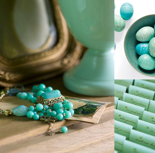
Color Inspiration: Seafoam and Turquoise
photograph via powder blue pics, eggs via martha stewart, cards via once wed
I've had this image in my inspiration folder for awhile- waiting until the perfect morning to share. Give that today's Super Tuesday and I'm about to go wait in long lines to vote, I decided today was the day for a calming, peaceful, and serene color palette. Hope you enjoy! (These colors always remind me of the early morning- just when the sun decides to peek through and brighten everything up.)
Color Inspiration: The lion the witch and the wardrobe
Northern Lights photo via here, illustration from The Lion , The Witch, and The Wardrobe movie via here Photograph by Emma Summerton and styled by Edward Enninful for W Magazine's Best in Class Shoot
I loved The Lion, The Witch, and the Wardrobe growing up. C.S. Lewis had an amazing way with words and his descriptions of the landscapes and characters put my imagination into overdrive. In particular, I always had a slight fascination with the White Witch. A few years after reading the book, I remember seeing the play being disappointed in how she was portrayed. All white with frosty eye makeup? I know she was technically called the White Witch, but I felt like the all white ensemble made her look frozen, not cold. Or worse, like a snow princess which evokes a whole different feeling. Silvers, blues, emerald greens- those are the colors I associated with her- the colors of ice. So when I came across this photo in W a few days back I couldn't help but be reminded that this is what I thought the White Witch should look like. Stark and cold, but beautiful. Shimmery and glamourous, with red lips, extremely pale skin, and slicked back black hair. I know it wasn't the intended purpose of the shoot, but thank you W for finally getting the image right in my mind.
color inspiration: midnight and blush
about time for another one of these, right? I'm kind of hooked on the really deep and saturated navy's paired with light breezy pinks.

salt flats photo via black eiffel, necklace via anthropologie, map via wit and whistle
color inspiration: frozen sherbet
streamers via somewhere splendid, martha stewart cake via once wed, painting by rachel sumpter
nothing better than sherbet on a hot summer day
Color Inspiration: peaceful palette (grey, blush, sienna, blue, cream, mint...)
thread via seesaw, thank you tags via elizabeth anne designs, love ice cream via grey likes weddings, greenery via with this ring
Sometimes I think we can have a tendency to get too wrapped up in specific color schemes and forget that not everything has to be one of three colors or even the same shade of those colors to work well together. That's why I love this inspiration- it's incorporates a range of muted natural colors- mints, mosses, blushes, sienna- and then throws in that pop of blue for good measure. And thanks to none of the colors being too jarring, the effect is incredibly peaceful.
color inspiration: blue, black and white (the 50's take)
ice cream cart via Sweet Lucies, for thunderbird via mr. t in dc, vintage phone via moS
There is something so incredibly retro and sweet about this shade of blue. Like if I looked outside I'd see a perfectly manicured lawn, a white picket fence and my steady boyfriend's ford thunderbird parked out front.*
*or a motorcycle if I happened to be dating the Fonz. Ayyy....
Color Inspiration: Pomegranate and Aqua
top photo styled by Lo Bjurulf for Ikea and Elle Decor, lamp photo via emerson merrick, flowers via saipua
I've had the Lo Bjurulf image on my desktop for months trying to find the perfect images to match it with. There is just something so mystical about it- the aquas, the haze, the jewel like reds all intertwined with the slight glimmer from the glasses. (can you believe it was a collaboration for Elle Decor and Ikea?) It just feels as though I stumbled upon a party right out of A Midsummer Night's Dream. I hope you enjoy it as much as I do.


