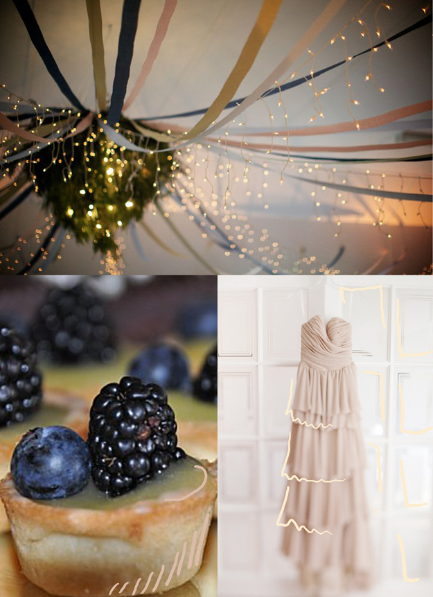
blush

color inspiration: charcoal and blush

gray, pink, charcoal and blush via courtney khail (photo by laura zalenga)

photo via Laura Zalenga

I finally found it. My perfect bedroom color scheme-dark and moody, but still somehow refreshingly calm and uplifting.

I know a lot of people tend to gravitate towards bright spaces- and I do too, kind of, when it comes to places like the kitchen or a bathroom. But aside from those areas (and sometimes even in those too) I always seem to fall hard for the dark, industrial, almost grittiness of charcoals, blacks, and greys. (Ever notice almost all of my photos are on a black background despite the industry standard of using white?) They remind me of figure drawing classes in college- where everything from your charcoal covered hands to the polished concrete floors were dark. The only light available was found peering in from beneath the studio door or the one spotlight on the model you were drawing.

Come to think of it, the scientific illustration/graphic design building was pretty dark too. Beautiful huge windows with gorgeous natural light, balanced perfectly with cold metal stairwells, worn wide plank floors, and computer labs completely pitch black apart from the eerily glowing screens of 24 Macs. Everything seemed to tell a story and have a purpose. Funny how those experiences define your style, isn't it? If only I could find a way to live in the Tanner Building. (Which I guess I technically did for roughly 4 years of my life.)

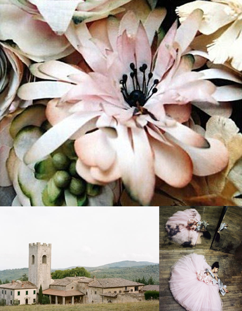
Color Inspiration: peaceful palette (grey, blush, sienna, blue, cream, mint...)

thread via seesaw, thank you tags via elizabeth anne designs, love ice cream via grey likes weddings, greenery via with this ring

Sometimes I think we can have a tendency to get too wrapped up in specific color schemes and forget that not everything has to be one of three colors or even the same shade of those colors to work well together. That's why I love this inspiration- it's incorporates a range of muted natural colors- mints, mosses, blushes, sienna- and then throws in that pop of blue for good measure. And thanks to none of the colors being too jarring, the effect is incredibly peaceful.

Plum, Blush and Fog

I think half the fun is coming up with the names of colors :)

And yes, I'm still on a purple kick.

This board plays up the vintage qualities of purple- utilizing more subdued shades of the color mixed with foggy grays and almost white blushes. Maybe it's the flower shop window or the simplicity of the cake, but this board completely reminds me of Paris. To me, it's a place where even the foggiest of days are magical and full of beauty.

row 1: flower adornments via violise lunn, dress via ritzy bee
row 2: dress via anthropologie, window shop photo and bedroom photo via the paris apartment
row 3: boutonniere via $10,000 wedding, cake via the knot