From the Studio

DIY picnic tote

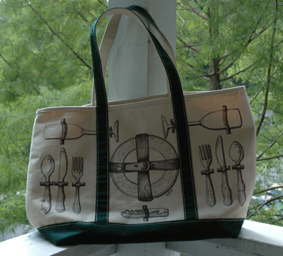
I'm huge fan of all the beautiful and unique picnic bags popping up lately, butcouldn't bring myself to buy another bag when I already own too many (I'm really working on the "less is more" philosophy.) Instead, I decided to take an old canvas tote I already owned and make it over. So here is how it turned out!

via personal collection

Step 1: Get a plain tote. This one (from LL Bean) used to be my grandmother's, but she handed it over to me awhile back because she never used it. Instead of taking off her initials (which I kind of like) I simply turned the bag around to the blank side. If you wanted though, you could pull out the seam ripper and go to town removing the monogram. I just didn't think it was necessary.

via personal collection

Step 2: Sketch out what you would like on the bag in pencil. I went with the whole "looking into an open picnic basket," but you could draw out wine bottles, loaves of bread, herbs...whatever you'd like. I'm a big proponent of drawing from life though, so I pulled out the mismatched flatware, the wine opener etc. to make sure everything would look close to how it should. (For me, this was most important for the buckle around the plates. I drew a blank when trying to remember what it should look like and had to bring out a belt!)

via personal collection

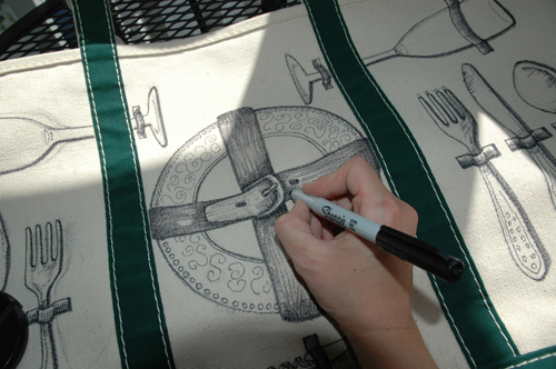
Step 3: Trace over your sketch with a Sharpie. You could probably use a fabric pen, but I didn't have one handy. (As an artist though, I always have sharpies around!) I decided to use two sizes- thick and thin- to create more depth in the objects. Pick where you'd like the light source to come from (thanks to studying scientific illustration, I almost always have it coming from the top left) and use the thick Sharpie on all of the areas that should have a shadow. For me, that meant I used it on the right side of my objects. Once that's done, use the thin Sharpie to finish the other parts and to add delicate details to the flatware, plates etc. I kept going and added more values to the straps etc, but that's not necessary. I just thought it made everything pop a little more!

Step 4: If you feel like it, erase your pencil marks. I didn't care if you could see the sketch so I didn't worry about it, but if it bothers you, feel free!

via personal collection

Step 5: Step back, marvel in your handiwork, and get to planning a picnic so you can show off your new bag! Hope you all enjoy!!

from the studio: sonja and blake

It's been too long since my last "from the studio" so today I thought I'd share my latest custom invitation!

copyright courtney khail stationery and design

A little back story:

When Sonja first emailed me, she knew she wanted a custom handwritten invitation, but wasn't 100% sure what she wanted those invitations to look like. She and Blake are both outdoorsy and very active (they got engaged on top of Mt. Rainer!) so we both knew their invitations had to have a natural vibe- wild, but still elegant. After we talked colors and wording, Sonja told me that their venue is covered in California poppies and Indian paintbrush blooms and we both knew right away that one, or both, of those had to be incorporated. I drew up a few different options, but in the end we all fell in love with this one! Having the viewpoint from slightly below makes the guests feel as though they are walking through a poppy field, while the bright orange blooms pop against the hand penned black ink. I love how these came together! And with each one just slightly different from the next, they really do look like a field of poppies when seen together.

Hope you enjoy!

The new website (and blog) is live!

Hi everyone!!

By now I bet you are all noticing that things are looking a little different around here, and you are right! Over the past few months I've been working with my friend Neil Summerour to create a BRAND NEW website. And what an amazing job he did! After seeing my simple illustrator mock ups, Neil took the website to a level I couldn't have even imagine. To say the least, when I saw everything all finished and ready to launch, I was speechless (which takes a lot, trust me.) Before I go on to explain some of the new features though, I want to say a huge thank you to Neil. I am so lucky to have such a talented friend and without his hard work this website would have never happened. Thank you!!

Now on to the cool stuff.

First, the header was completely redone. I really wanted the site to feel airy. Kind of like a blank canvas where the photographs of my work would really pop. Incorporating the logo Andy Carlyle created for me a few months ago, Neil cleaned everything else up. The menu was overhauled with a new crisp font (the same font as "stationery and design" in my logo) and now when you roll over them, a simple little line pops up under the word. Small touch, I know, but I was pretty excited about it. The biggest surprise to me was the watercolor wash over the top of every page. I just love (love love) the organic feel of it.

Second, the home page. New photos were added, the pace picked up (so you didn't have to wait so long to see the next image) and a "number" tab was added so you can jump to, pause, and then play the image slideshow.

Then of course, the gallery, weddings page, and custom pages all were redesigned, with brighter images (clickable to view larger), new fancy titles (which match my logo as well,) curved drop shadows, and of course even MORE images to show some of the different items I can create for you.

Have you looked at the footer? There you can find links to contact me (on the brand new contact page!), become a fan on facebook, follow me on twitter... pretty much anything and everything you need all condensed in on little area.

And of course, one of the most exciting things to me is that the blog is now integrated into the site! Neil imported the entire old blog into the new, working with designs, etc and I have to say- I love the results (dates in gray circles?! yes please.) And now I have fresh new categories (I re-categorized and tagged each post into the wee hours of the morning so they are more accessible now.) Now I just have to get used to Wordpress!

So have fun with the new website! Go explore, click around, become a fan, follow me on twitter, peruse the blog- whatever you would like . And as always, feel free to spread the word!

Have a great day everyone!

Lauren + Kyle (Studio Peek)

copyright courtney khail stationery and design

Happy Friday everyone! I hope everyone is having a great day and that everyone's weekend is just as wonderful.

I wanted to share an invitation I created a little while ago for the lovely Lauren. She and her husband to be Kyle are getting married this month and are having a small intimate reception to celebrate. To let friends and family know of their plans, she asked me to create an invitation inspired by the old tradition of guests receiving a hand written note from the bride (or bride's family) inviting guests to the celebration. Because Lauren is using white hydrangeas as her main flower, she chose my hydrangea design and I painted them with the light green and yellow washes that are commonly found on "white" hydrangeas. Inside the note card, each guest was greeted with a note hand written especially for them. I had a great time making these for Lauren, and wish the two of them the best! I hope your wedding and marriage is everything you both hope it will be.

And can I just say one more time how much I love that the hand written tradition is coming back to the wedding scene? It's just so personal and special!

Our rock stars aren't like your rock stars

So I opened up my email this morning and was surprised with an awesome gift.

All yesterday afternoon I swooned over the different type at Veer and by the time I started making dinner I had fallen in love with one particular script. A script I really really didn't have to have, but really really wanted. J thought it was really nice (a little too scripty for his taste, but he appreciated the line quality) but acting as my practical side he convinced me to hold off on buying it for a little while. Even so, I couldn't help but share my new found obsession with my friend, N.- who in addition to getting my new website up and running, happens to be a (famous*) type designer. i.e. he'd completely understand my "love at first sight" over this script.

And he did. And he knew the designer of the type I loved! I was shocked. Not only did he know him, but he used his nickname. You know the intel commercials that says "our rock stars aren't your rock stars?" It was just like that. It was like texting your friend about falling in love with with a wedding dress and your friend texting back, "oh, is that Vera's? We're having lunch tomorrow." Craziness.

anyhow, back to this morning's email.

I opened it up and ta da! Ready to be downloaded, waiting patiently for me to use it, was THE script.** Have I mentioned how much my friends rock? Because if not, they are the best. Thanks, N!

*he's doesn't always admit this, but the many accolades support my statement. ** This is where I started jumping around our living room singing "yay yay yay!" as J asked me to breathe and tell him what I was so excited about :)

Peek into the Studio

the invitationscopyright courtney khail stationery and design

the rsvp envelopes copyright courtney khail stationery and design

Just wanted to show you all a little of what has been keeping me so busy these past few days.

This is an order I've been working on for a while now and I just finished the last envelope! It's so rewarding to see everything complete.

I also thought I would show a few things that have been going on this week outside of work.

A few images from our Valentine's Night dinner:

the table
yuuumm. I could live off of antipasto platters.

A lovely card from one of my best friends in Boston (I love getting letters in the mail. Almost as much as I love her!)

this made my night :)

And lastly, this showed up in the mail earlier in the week:

If you can't tell, it's the March issue of Martha Stewart Living. I didn't order it for myself, J didn't, and my mom can't remember if she got it for me for Christmas or not. Either way, it was a great surprise!

Now, I'm so excited it's finally the weekend! Tomorrow we're going out to celebrate one of our friend's birthdays (and maybe sneak in a morning hike,) but tonight I'm hoping for a relaxing night in :) Have a great weekend everyone!

hayley + ben

Happy Friday everyone! With the week coming to a close, I thought I would share my most recent finished work.

Hayley and her fiance' are having a small intimate wedding, but that in no way meant she didn't want beautiful invitations, etc. Despite being far apart (she's in Australia and I am here in the US) she contacted me a little while ago to see if I could design something for her.

I don't think I could have said yes any faster! Small wedding in Tasmania? Heck yes. Sounds like my kind of a party :)

Hayley really loved the peony design, but wanted it painted in shades of green as opposed to the reds or purples I normally do. She preferred brighter greens, so when painting the invites I paid close attention to blend the blues and yellows carefully, using just enough blue for depth, but mostly allowing the cheeriness of the yellow to pop. For the text, I took inspiration from "the old days" (personally I find weddings from the past to be much more intimate than today) and decided to hand write each invitation. Because Hayley wanted each person to be invited by name, this was a perfect fit! It took a few tries to make them perfect (thank God for my light table!) but I am so pleased with how these turned out.

Hayley has been such a joy to work with! From the very beginning she was really open to new ideas and seemed to trust that my creativity (and type A personality) would create something perfect and unique for her. For example, she was all for having me address black invitations with stark white lettering (a look I am absolutely in love with) in lieu of plain white envelopes. And to have everything unified, she asked me to create matching programs (I'll share these after the wedding so I don't ruin the surprise!) and place cards. I am so excited for these two and can't wait to see pictures of their day! With all I have heard, I know it will be amazing.

So what do y'all think about them?

Anyway- thanks for letting me share and I hope everyone has a fantastic weekend! I'm hoping to make it to a friend's birthday party tonight (I've tried to squeeze too much into one night so we'll see) and then have a nice relaxing Saturday and Sunday. Any big plans for you all?

Happy Birthday to me...

via personal collection

Tomorrow is my birthday (!!) so today will be a 1/2 day of work and then the rest full of fun. J and I are going out with my sister and her boy to celebrate with dinner and drinks and then heading to visit my parents early the next morning. Not sure we'll be doing our normal Ben and Jerry's ice cream cake tradition, but if nothing else we'll have to stop by and have a cone after dinner. I love their chocolate therapy.

Something else I love? Birthday mail. It always makes me so happy to get things other than bills in our mailbox and to feel the love from my family and friends when I read the cards. Even anthropologie sent me a card (the one at the top.) Isn't it fun?! They are always so creative with their mailings. The candle on this one is actually a necklace to wear on your birthday. Can't wait to rock it.

And some non birthday related exciting news-

1) my new website is in the works and should be done very soon! (Huge thanks goes out my amazing friend Neil for helping me with this.) I am super stoked about this not only because it has a more streamlined look (which is what I want) but it also shows my new designs and way more examples of my wedding works. I can't wait to share it with everyone!

2) Meg is talking about me today over at A Practical Wedding! Head over to see what she has to say and if you are so inclined, leave a comment :)

3) my new business cards are in and look awesome. I love handing these out- the paper is so nice :)

Guess that's all for now. I hope everyone has a wonderful Friday and that your long weekend is filled with tons of fun and even more memories! See you Tuesday!

At least it hasn't been a full week.

I always get a little sad when the blogs I read aren't updated often, and then what do I do? Disappear for almost a week. I've been hard at work for the past few days and am trying to get back into the promoting/advertising/etc swig so I can keep my name out there. Guess having a lot of work is a really good reason to be MIA though! And on that note, just a few self promo moments before I start sharing pretty things.

Are you a fan of Courtney Khail Stationery and Design on facebook? I would love for you to be. Just click here.

Know anyone who needs stationery or wedding invitations? Feel free to pass my information along :) Click here for the website.

Okay, now on to some of the great things I've seen over the week.

Awesomeness via the flashdance
I absolutely looove these large wax candles. via hootnholler
Simple, clean, and all about the love. Exactly what I think a wedding should be. via a cup of jo

Hope you enjoyed!