Colour Inspiration

Color Inspiration: venetian sunsets

sunset via simply photo, Burano homes found on plenty of colour

I have been so excited to share this color inspiration with you all. It's slightly different from my other inspirations given that it only has 2 photos (the others I try to include at least 3, though normally 4)  but the colors were just so breathtaking I didn't think it needed anything else. Aren't they amazing?

The photo on the bottom is of Burano- an island in the Venetian Lagoon where each house is painted a different bright color. Apparently, it was so the fisherman who were coming off the water could recognize their house when it was foggy. Fun fact, in order for anyone in Burano to paint their home, they have to send a request to the government, who will respond by letting them know which colors are permitted in their lot.

No matter the reason (or process) behind the colors, I love how this section perfectly captures the colors of a beautiful sunset. I'm always taken aback by the vivid colors of a "perfect" sunset so to see them captured on homes is just thrilling to me.

Looks like I know a stop we'll be making on our next trip to Venice!

color inspiration: dreamsicle

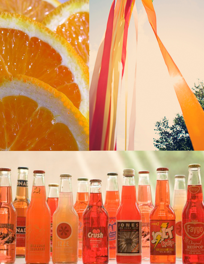
orange slices from c.zwerg, streamers via our labor of love, sodas via oh happy day

J and I decided to try out New Orleans SnoBall this weekend since we'd heard such great things about them. Side note, they completely live up to the hype. They were wonderful.While I played it safe with a nectar, peach, and strawberry concoction, J opted for the dreamsicle and it's been on my mind ever since. Bright, refreshing and rich- it tasted exactly like the frozen treat. Taking a cue from it's bright orange color and sweet creamy taste, I thought I'd create a board that featured the same characteristics. Although I tend to lean towards more muted colors, I love how refreshing and vibrant citrus colors are and how easily they all work together.

Color Inspiration: ballerina pink, Bordeaux crimson, and dove grey

flowers via 29 blackstreet dove grey shoes via this is glamorous, max wagner balloon photo via cup of jo

Colors ranging from ballerina pinks into deep Bordeaux crimson lend a dose of romanticism, while the dove grey brings in a touch of sophistication. I love how easy this color scheme is on the eyes, while still evoking a sense of drama to an event or space.

color inspiration: rosemary and lemonade

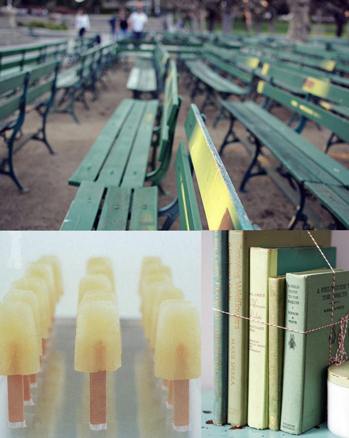
benches via mustard and sage, Popsicles via oh happy day, books via whichgoose

I love this color combination! It's refreshing and crisp and clean and kind of reminds me of warm summer mornings in Italy. Normally I wouldn't mix green and yellow together, but since they are so muted they work together perfectly. Speaking of Italy, there was this one park in particular where they would screen a different American movie each week of the summer and the chairs were painted this exact green. They were so perfectly worn and beautiful with their different layers of paint poking through.

color inspiration: rainy day grey

Interior photo by Polly Wreford, nap photo via le love, storm photo via tec petaja, cloud cookies via forty sixth at grace

I woke up this morning to a beautiful sunshine filled day, but by mid afternoon the clouds had rolled in followed soon after by a thunderstorm. Before I knew it, I was creating a board centered around stormy clouds, grey interiors, and cumulus cloud cookies. And for good measure, I went ahead and threw in a photo capturing my favorite rainy day activity-mid day naps.

Color Inspiration: peaceful palette (grey, blush, sienna, blue, cream, mint...)

thread via seesaw, thank you tags via elizabeth anne designs, love ice cream via grey likes weddings, greenery via with this ring

Sometimes I think we can have a tendency to get too wrapped up in specific color schemes and forget that not everything has to be one of three colors or even the same shade of those colors to work well together. That's why I love this inspiration- it's incorporates a range of muted natural colors- mints, mosses, blushes, sienna- and then throws in that pop of blue for good measure. And thanks to none of the colors being too jarring, the effect is incredibly peaceful.

color inspiration: blue, black and white (the 50's take)

ice cream cart via Sweet Lucies, for thunderbird via mr. t in dc, vintage phone via moS

There is something so incredibly retro and sweet about this shade of blue. Like if I looked outside I'd see a perfectly manicured lawn, a white picket fence and my steady boyfriend's ford thunderbird parked out front.*

*or a motorcycle if I happened to be dating the Fonz. Ayyy....

color inspiration: coffee, parchment, and velvet

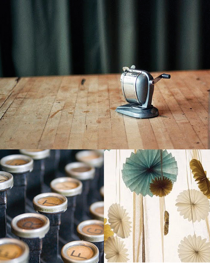
pencil sharpener photograph via Jen Causey's blog Simply Photo, typewriter keys via peonies and polaroids,the pinwheels photo has been on my desktop for forever, but I've never been able to find where it's from. Could one of you please help me so I can give credit where it's due?

Unlike most people I know, I really loved school. (And I actually mean the school part of it.) Of course, my education was definitely unique so that may be why I have such fond memories of it. I spent 5th through 12th grade at a fine arts magnet school where at any time during the day you could wander around and hear the jazz band, watch dancers practice choreographed routines, see kids painting or throwing pots, etc. Once I got to college, I studied scientific illustration and even though I did have science classes (which was actually where I met my husband), most of my days (and many a week day nights) were spent in the studio joking around with my friends.

Those uncomfortable metal stools with the wooden top?  Always reminds me of critiques (and never being able to get comfortable.) Pencil sharpeners? I can already smell the graphite and wood shavings. And no whenever I see a can of white paint, I'm always reminded of the final days of a show when you've taken all the work down and are repainting and repairing the walls for the next one.

While most people I know tried everything to get out of school, I always felt like it was part of me and that I was part of a long line of artists who studied there before me. So when I found Jen Causey's photograph of an old pencil sharpener, I was immediately reminded of studio days in college and knew I wanted to do a board around it. This one in particular reminds me of old wooden floors that creak as you walk across them, parchment and tracing paper scattered across tables, natural light streaming through old glass panes, and the smell of coffee (and quite possibly whiskey from the night before) that was forever lingering in the air. (If you'd like to see our old building, you can view it here.)

And for anyone wondering where the velvet comes in- blame it on elementary school. Anytime I think of velvet I think of a deep green and am reminded of the super heavy stage curtains that framed the little stage in our cafeteria. (Of course those were red I think, so who knows why green comes to mind....)

Color Inspiration: Pomegranate and Aqua

top photo styled by Lo Bjurulf for Ikea and Elle Decor, lamp photo via emerson merrick, flowers via saipua

I've had  the Lo Bjurulf image on my desktop for months trying to find the perfect images to match it with. There is just something so mystical about it- the aquas, the haze, the jewel like reds all intertwined with the slight glimmer from the glasses. (can you believe it was a collaboration for Elle Decor and Ikea?) It just feels as though I stumbled upon a party right out of A Midsummer Night's Dream. I hope you enjoy it as much as I do.

Antique Coral, Cream and Turquoise

flowers via saipua, shoes photo by Lisa Lefkowitz, bike photo via gypsie (on my mind), vintage book photo by Cassia Beck via seesaw

I have a soft spot for old books. The yellowing pages, the softened colors, the smells- it's all very comforting to me. So when I saw this photo by Cassia Beck on seesaw, I knew I wanted to create a board based around it. The colors remind me of a lazy sunny day- maybe one accompanied with a picnic in the park or a nap in the sunshine after reading a good book in a hammock.

Color inspiration: Strawberry Lemonade and French Vanilla

vintage beach engagement photos via tim melido (found on green wedding shoes), bellini's via marthastewart, striped straws via oh happy day

Maybe it's the time spent at the beach, but I'm really loving the fuzzy vintage colors in these images. Everything kind of melds together and nothing is too vibrant or over powering. The reds aren't exactly red thanks to their orange-y tint (more of a strawberry lemonade/daiquiri color,) and the whites are more of a worn down cream (almost the exact color of homemade french vanilla ice cream.)

And can we please take a moment to admire Tim Melido's photo? Isn't it beautiful? (And p.s. her vintage bathing suit is amazing.)