Cool Things

Good Design: Tap Water

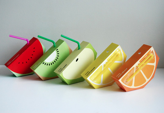
designed by Racquel Youtzy via lovely package

I love this packaging for tap water. Unless we are camping (like right now) we rarely buy bottled water. And even though we like knowing it keeps plastic out of the landfills, the main reason we don’t buy bottled is that our filtered tap water* tastes just as good (if not better) than many of the brands on the market. Of course now with these bottles, we all can enjoy better tasting (inexpensive) water and still feel all special with our beautifully designed glass bottles. I can’t help but think about how hilarious it would be to put these out for a meeting or a dinner.You know, for everyone who insists on bottled water.

*speaking of bottled water- did you know most bottled water is actually just filtered tap water with or without added minerals? If it says it's from a "municipal water source" that's what it means.

Studio Sneak Peek: road trip

Hey everybody! So I have a secret.

And it's kind of a big secret.

via say yes to hoboken

We're in the car right now starting a six week long cross country road trip. Crazy right?! We know.

But it's something we've both wanted to do together for forever and given that we knew we probably wouldn't have another continuous six weeks anytime in the near future to do this, we're taking the plunge.

So! After two years of stockpiling camping equipment, booking hotels and campsites (anyone remember my super excited tweet about getting our Yosemite campsite? yea. that was nerve wrecking,) researching cities and trails, and most importantly hoping that everything would fall into place (which thank God it did) the day is finally here. The house and pup are being cared for, the car is packed (and I mean packed. I'm amazed at the amount of stuff that can fit in a normal 4 door sedan) the ipod is loaded with hours and hours of music, and we're heading west. I am so excited to see the national parks, experience the cities, and see friends along the way!

Of course I couldn't just leave you all with radio silence for six weeks, so while we're gone I have some exciting things to share.

First, my new designs are finished! (yay!!) So every Monday I will do a Studio Sneak Peek featuring a different design to let you in on how it how it came about, what I was going for, etc.  annnd... in addition to that, on Fridays some of my favorite blogger friends will be stopping by to share a weekly dose of summer with you. As for Tuesday through Thursday, I've been busy writing posts for each day we're away so you'll never be without.

Sounds almost as cool as a road trip, right? I thought so too.

See you all in six weeks!!! (okay let's be honest, I'll probably stop in every so often with photos...)

happy (memorial day) weekend!

photograph via will adler

This weekend is one of my best friend's weddings and I am so excited we get to celebrate with her and her new husband! (I'm still incredibly honored she asked me to stand by her side.) Seeing two people that mean so much to us promise to love and support each other for the rest of their lives makes my heart smile. It's such a momentous, touching, and love filled occasion and I can't wait to be there. (I've already warned her I may tear up.)

Now on to the links:

I need this ring.

Have you seen these photos? So amazing.

Normally I steer clear from jello shots (I don't think you should have to chew your drink) but these have me giving them a second look.

These are CARDBOARD. (I know!)

I think a giant balloon could make any one's day.

I love NYC, but this cracked me up.

And speaking of weddings, someone propose with this. gorgeous!

Hope you all have a wonderful Memorial Day weekend!

*I also wanted to say a big thank you for everyone who has sent their kind words to me about my grandmother. They mean the world to me and I really appreciate them (and you all.)

Studio Sneak Peek: Clothespin Magnet

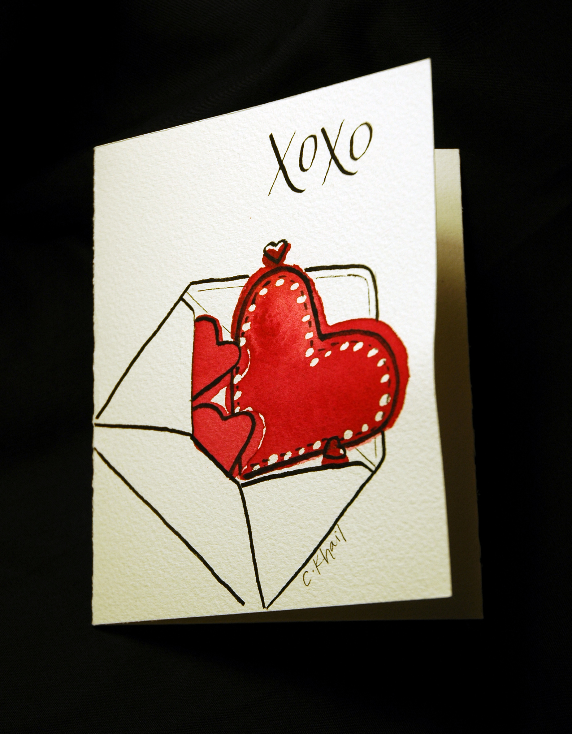
via courtney khail stationery and design

Thought I'd share what I made this weekend while I was waiting on a few new pieces to dry. Given that wedding season is quickly coming upon us, our refrigerator is being taken over with invitations. Unfortunately, our magnet selection (which is a lovely array of sorority magnets, save the date magnets, free pizza magnets and bottle opener magnets) just wasn't able to do it all. Because I refuse to buy magnets (that aren't country flag bottle openers of course) I figured I'd just make some. There were only three requirements: 1) they had to be decently attractive  2) they had to hold things well and 3) I didn't want to have to buy anything.

After a little brainstorming I remembered that my sister has these fancy schmancy heavy duty metal clothespin magnets (that could hold a small child if need be) and given the weight of some of these invitations I figured something similar would be our best bet. Plus, I already had clothespins, paint, and magnets (thanks to our own extra save the date magnets)

This is how it went down:

Step 1- get all of the stuff you need together. In my case, that was a magnet, rubber cement, a clothespin, silver paint, scissors and a paintbrush. (I used a cheap foam brush I had in the back of my supply closet.)
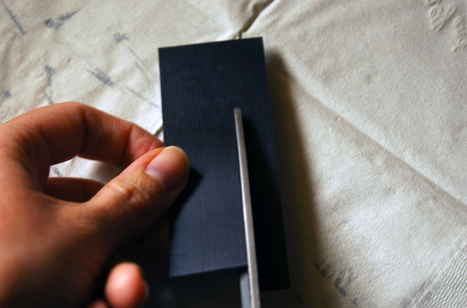
Step 2- Cut magnet to fit on back of clothespin. Using rubber cement, attach it to the back of the clothespin. If you are unlike me and have patience, give it a few minutes to dry. If you're more like me and hate waiting, blow on it once or twice and then start painting.
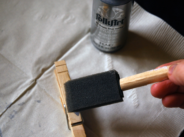
Step 3- paint the clothespin. I didn't like having to wait here either so I kind of just painted 3 quick even coats on and hoped for the best. Once that has dried (and I only waited for this because I quickly realized trying to open the clothespin while it was wet smeared off the paint I just put on) paint the visible insides of the clothespin and touch up any spot on the outside that don't look "silvery" enough.
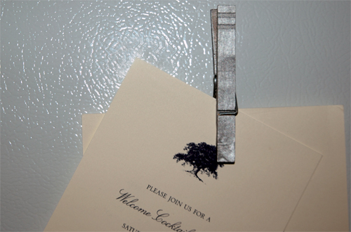
Step 4- Let it fully dry and then hang it up on your frig. (Try not too be super jealous of our beautiful white apartment frig. I know it may be difficult.)

Step 5- (optional) Step back and tell yourself how handy you are. Maybe call your mom and tell her what a handy daughter she raised, or drag your husband away from studying to see how cool of a wife you are and how much nicer the frig looks. (He may or may not tell you that you have too much time on your hands.) Ignore said comments and spend the next few minutes trying to figure out how much the clothespins can hold before they topple of the frig. (As of this morning, I've fit 3 invitations. Or 1 invitation with 3 pieces to it. And let's be serious here, if you're including more than 3 pieces in your invites you are saying too much and they won't make it onto my frig.)

So there you have it, how to make silver clothespin magnets.
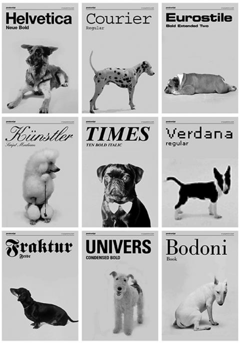
Good Design: Andrew Capener Designer Scrabble

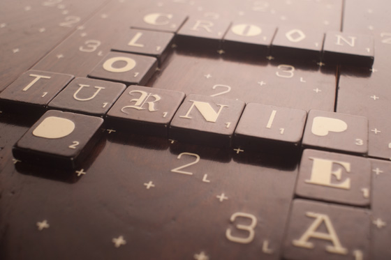
Scrabble concept created by Andrew Capener via Design Crush

It's really not that difficult to beat me in Scrabble (most likely because the moment I see the mixed up tiles I forget almost every word I've ever learned past "cat" or "dog,") but at least this way I could focus on the pretty board and it's different tiles as opposed to my losing score.

A little more on the project thanks to Monoscope:

“The idea was to excite people about typograqphy by giving them the ability to choose what font their scrabble set would come in. The set would come in the font of your choice or with an assorted font pack. The scrabble board and interior box are made out of solid walnut, and the exterior box is made from birch. Each of the 6 board pieces is magnetized to fit together perfectly and each piece slides nicely into its respective slot in the box and is secured by interior magnets as well. The interior of the exterior box as well as the bottoms of the 6 board pieces are lined with cork, to protect them while in use.”

(Too bad it was just a concept. Looks like I may just have to make my own!)

Good Design: Positype

via here

So the ever talented Neil Summerour just launched his new website and it is beautiful.  It's clean, bold, has everything located in one central place. Oh! and it has a ton of white space (I love white space.) Not only does it show off tons of Neil's typefaces, but it also showcases his lettering work. AND he includes sketches! I'm such a sucker for sketches. Don't just show me the final product all shiny and new- show me the hard work; the out takes; where the pen (or lipstick in one example) met paper and the thought became real. (yes, I am quite aware that I am a nerd and no, I am not ashamed.)

And I'm not just singing his praises because he's one of my closest friends, or because he put my site together (which yes, I am a little biased towards but it is pretty awesome,) or even because I can see some of the suggestions I made actually made it onto his site (even more awesome.)

Nope.

I'm saying that because it's true and because Neil isn't one to shout it from the rooftops, even if he should. He actually isn't one to speak much about himself at all. Reading his "about me" section, I learned things I never knew and I've known him for over 5 years. Granted, one of those things was blood type and that's not something that normally comes up in conversation. At least not in conversations where you aren't looking for a kidney or something. ( To be honest, I can't even remember my own blood type. I think I'm O, but I don't give blood so I don't really know. And before anyone tells me why I should give blood, I don't hit the weight requirement and I don't like seeing my blood drain out of me so no donating for me.)

But back to the point of the post- the site. Go on and click here and take a moment to look at the awesome things he creates. Maybe you'll even recognize a few things he's done- like work for Victoria's Secret or Panera Bread. Heck, even ABC is on his client list. (He's kind of a big deal.)

And now, if you'll excuse me I have to go admire fonts like Epic and Magneta (and screen any "I can't believe you wrote a post about me" phone calls I may be receiving...)