Colour Inspiration

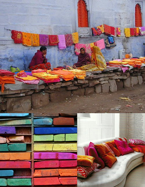
color inspiration: magenta, fuchsia, and paprika

market photo via here, pastels via a beautiful mess, room via bright bazaar

I stuck to a similar palette as last week's color inspiration, but amped up the intensity by focusing on the bright, bold colors of places like India and Morocco. I love how they have a way of being richly saturated and luxurious, but at the same time also very earthy and natural. (Wouldn't it be an amazing experience to be in India during the Holi festival?)

color inspiration: navy and pink

tassel garland via confetti system, top right photo via elizabeth messina, guitarist via elizabeth anne designs

pairing navy and pink almost always means preppy. I wanted to show how that isn't always case. By throwing in charcoal gray, gold, silver, seafoam, and white it makes it all a little more hipster and a little less country club. Of course if you add the confetti system to just about anything it's already going to be more fun.

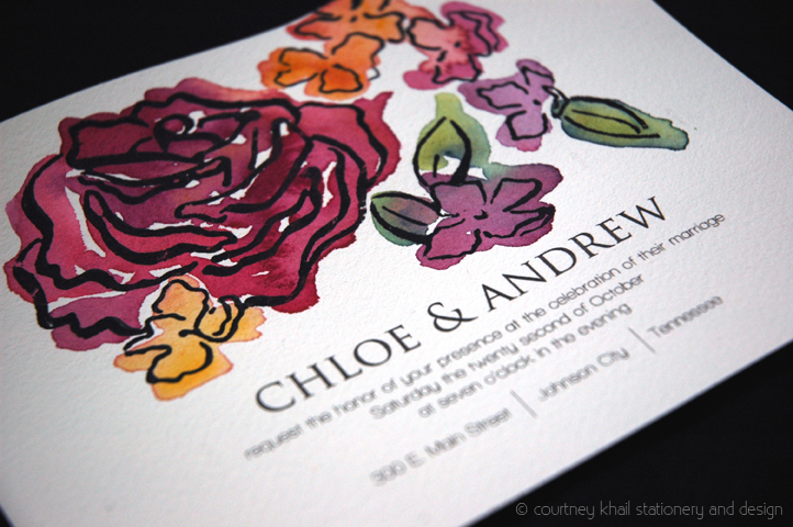
Studio Sneak Peek: Lilac and Rose

"Lilac & Rose" copyright courtney khail stationery and design (feel free to share, but please give me credit and link back to my site.)

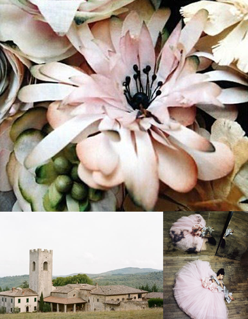
Week three of my new design introductions is the design "Lilac & Rose." I love how unique the lilac is- the color gradients, the shapes, the "petite-ness" of them. While they all follow the same basic design (petal numbers, growth patterns, etc) there are such beautiful nuances in them. I wanted to balance those nuances with the familiarity of a common everyday rose. By playing with scale and deconstructing the plant, I was able to bring focus on the individual lilac blooms as opposed to the entire plant. Once I did that, I arranged them in an almost dance-like pattern around the rose in order to keep your eye bouncing around the composition instead of getting stuck in any particular section. And given that I'd already taken a lot of artistic leeway with the lilacs size and shape, I decided to go ahead and play with color as well- morphing the normal purple into a warmer magenta, then a purple-ish orange and finally into a yellow.

Since the design itself has a lot going on, I opted for a simpler, clean layout that focused on the names of the couple and utilized a lot of white space so your eyes wouldn't get overwhelmed.

Color Inspiration: Strawberry Fields

courtney khail color inspiration strawberry fields

strawberries via tiny white daisy tumblr, open sign via personal collection, tent via party perfect

To me, strawberries are synonymous with summertime-and paired with crisp white and grass green nothing is more nostalgic. Makes me want to nap in a hammock, eat grilled corn on the cob and catch fireflies. Can you tell I was raised in the South? I would have added something about being barefoot, but that would just leave the door wide open for the jokes...

Happy first official day of summer!