Colour Inspiration

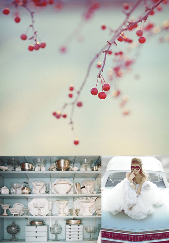
berry red and robin's egg blue

Three Little Berries photo via LaneyButler's etsy, girl on car via a beautiful living, Eddie Ross's awesome light blue butler's pantry via eddie ross

It took me awhile to like this combination (and about 3 weeks to find the photos I liked for it)- mostly because outside of the stars and stripes, this combo has been attempted (and failed) many times before. What I think is key is to use muted, airy versions of red and blue with a lot of white. Nothing too saturated or it'll start looking like you just bought everything you saw at an after the 4th of July clearance sale (which unless you're going for a kitschy Independence Day theme, really isn't what you want.)

Color Inspiration: lemon, watermelon and lime sorbet

my kind of ferris wheel via moS.nap flickr, popsicles via oh happy day, and cotton candy via martha stewart

For the past few days it's been warm(er) in Atlanta and because of this I've been tricked into thinking spring is coming. (Keyword, tricked. "Oh! Look! It's 70 degrees today. Must be time to break out my sandals." No, Courtney. It's still February. Put away the cotton dresses and opt for jeans. Because while it's 70 right now, by 7pm tonight it's going to be cold and you will look ridiculous. This is hypothetical of course. I wasn't wearing a dress.)

Anyhow, even if I can't rotate my closet yet, I can dream about warmer, sunshine filled days. Hence the super cheery color inspiration today. And color names that revolve around sorbet; a treat most of us only eat when it's hot outside and we are in bikini's and therefore cannot justify eating the chocolate cake. How fun are these colors? (that was my attempt to not go on a "how much I dislike trying on bikini's" tangent.) Reminds me of what I always wished fairs were. Bright, retro pastel colors, crisp, fresh air, and yummy treats like tart Popsicles and sugary cotton candy. Unfortunately, fairs are not like this at all (hence why I don't go to fairs. Well that and the whole motion sickness thing.) Instead of being sweet nostalgic events, today fairs are normally smelly and filled with loud noises, jarring colors, and "treats" like deep fried oreos and other "please tell me people don't really eat that" options. Of course, those images do not make for a beautiful color inspiration board so I'll use my dream version instead (because it's better.)

color inspiration: fire, nylon, and other campfirey colors

tent photo via you are my fave, mason jar candle holders via east side bride, awesome red lamps via an apple a day

Hmm. Maybe I got a little too excited with the title today. Eh, whatever. Sounds better than red, blue, green and yellow, right?

So camping has been on our minds a lot lately (counting down/preparing for the road trip this summer) and as we wander around REI and peruse online gear sights I slowly found myself falling for the slightly kitschy, overly saturated colors of camping. You know the ones- the hunter greens, the navy blues, the marigolds, the deep reds. (If you're having a hard time imagining, just open an L.L. Bean catalog.) Combine those with the glowing embers of a campfire, the all encompassing darkness just outside of your lantern's reach, and the jewel like glow given off by a tent that's lit from within and I'm in love.

There's just something so peaceful and enchanting about being alone in the woods. (And by alone I mean with at least one other person, a car within 20 miles, and my kindle. I'm not trying to pull an into the wild* "die by myself because I wasn't prepared moment" here.)

color inspiration: navy, tangerine, and white

top photo via visuelle mints via an apple a day, ford via my funny eye

I love the color combination of navy and tangerine (well, off of the football field at least.) It not only manages to find the perfect balance between retro and modern, but preppy and hipster as well. Can't you imagine an 80's (who am I kidding, I think I saw this outfit last summer) frat boy wearing a navy and white sweater with crisp (possibly too short) orange shorts just as easily as you can a hippie dancing around in a flowing navy sun dress with bright orange flowers in her hair? What about a super modern all white loft with touches of navy and orange or a home from the 60's with orange shag carpeting and navy rimmed china on the table?

See? This combo can go either way. Just depends on the person and the connection the feel to the colors.

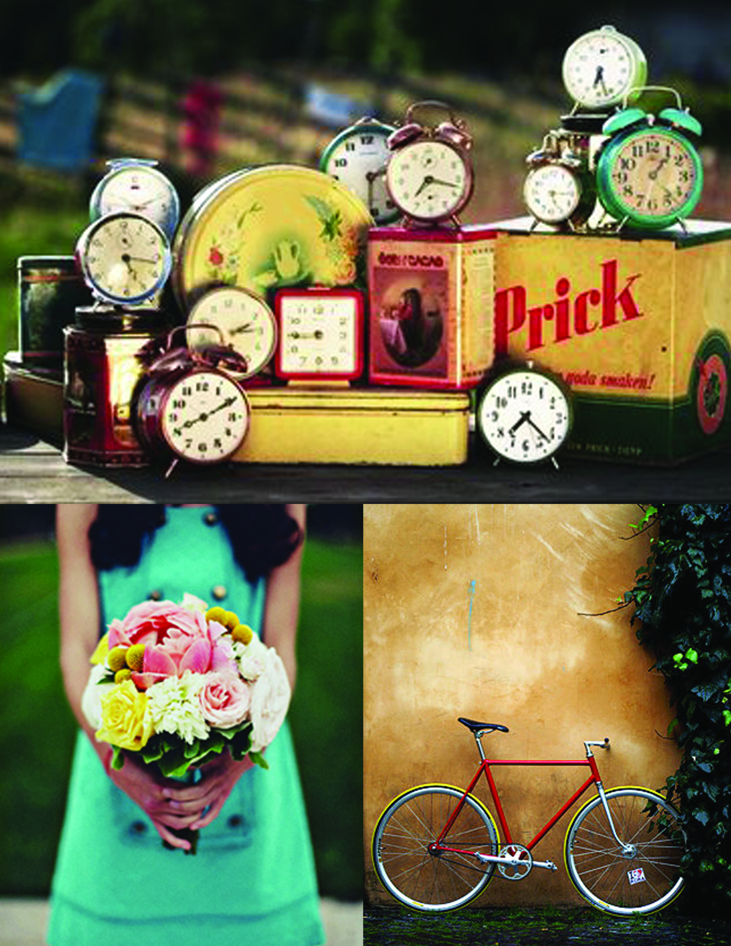
color inspiration: tomato, turquoise, and retro yellow

clock photo via a beautiful living, dress photo via once wed, bike photo via ffffound

primary colors gone technicolor. I love how cheerful and bright these colors are together! And since they aren't the normal shades of red, blue and yellow the overall look exudes a nostalgic vintage feeling rather than that of an elementary school pencil box. (Though I do have a pretty awesome Ninja Turtle pencil box so I'm not judging here.)

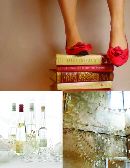
Color Inspiration: Cherry and Gold

photo via lovely little things, martha stewart bar via ritzy bee, flags via solid frogs,

There is something incredibly luxurious about saturated colors. The depth of an emerald, the bright yellow of a freshly picked lemon, the creamy brown of fine leather- you only need a hint of a truly saturated pigment to make an impact. I think that's why I've had this photograph stuck in my mind for months now. The punch of cherry red from the shoes paired with the slight glimmer of the gold just hooked me.  On one hand the combination reminds me of old libraries, formal dining rooms and the opulence normally reserved only for palaces (or homes that wished to be palaces), but when used in small doses there can also be something very curated and elegant about it. Like adding the perfect red lipstick to a normally mundane jeans and t-shirt combo, or  seeing a red vintage bike propped up outside of an old faded cafe wall.  Either way though, I always love the vitality these colors bring with them.

Color Inspiration: molasses, parchment and slate

martha stewart caramels via ritzybee, landscape via wishfulfillment, dress photo via anna williams (found on city sage)

The snow here is still holding on tight (and by tight I mean it's turned to ice that even the DOT is having a hard time combating) so everything still has a beautiful stillness to it. (If you ignore the people who for some reason think their summer tires are good enough and that by living in Atlanta they somehow have mastered driving in snow. Come on people, you're not impressing anyone and kind of look like a jerk as you spin out and put others lives in danger. Okay, back to the point.)

So when I was coming up with today's color inspiration I wanted something warm and calming. We've had a fire burning pretty much constantly for the past few days and after it's out and we're heading to bed the charred wood has a beautiful slate green grey covering it. I decided to take that color (which impressively is the same color as a field covered with a frozen morning dew) and combine it with a luxurious chocolate brown (oh my gosh that dress is phenomenal) and the color of the parchment that covers homemade caramels (or homemade cookies as in my case) and this is what evolved. (I can almost hear the crunch of the thin ice under my boots and smell the wood burning.)

Stay warm everyone!

Color Inspiration: black, white and grey

(images via apartment 34, simplesong, and unknown-please let me know if you have the info!)

January always reminds me of a black and white photo. Maybe because outside the weather is crisp and the landscape is dusted with snow, maybe because I associate NYE with black tie events or maybe just because there is a stillness to it after the whirlwind of the holidays. Either way, January always seems so quiet and calm to me- a perfect start to a fresh new year.